At Shortcut, I built and shipped the company’s first end-to-end design system. I established core foundations, created scalable component patterns, and led the documentation strategy that enabled clarity, consistency, and accessibility across the product. I also partnered closely with engineering to align system variants with code, unlocking rapid delivery and reusable UI at startup speed.
Role
Staff Designer
Team Size
3
Company
Shortcut
Year
2021

As Design System Lead and sole contributor, I:
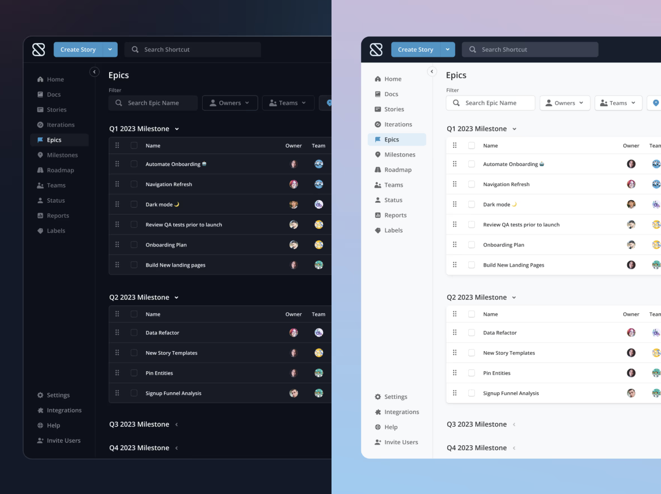
Built and scaled Shortcut’s first end-to-end Design System across Figma, tokens, React, and documentation.
Paid down years of UX and front-end tech debt by standardizing components, interactions, and accessibility across the product.
Launched a fully tokenized, accessible light and dark theme that enabled rapid, consistent UI development.
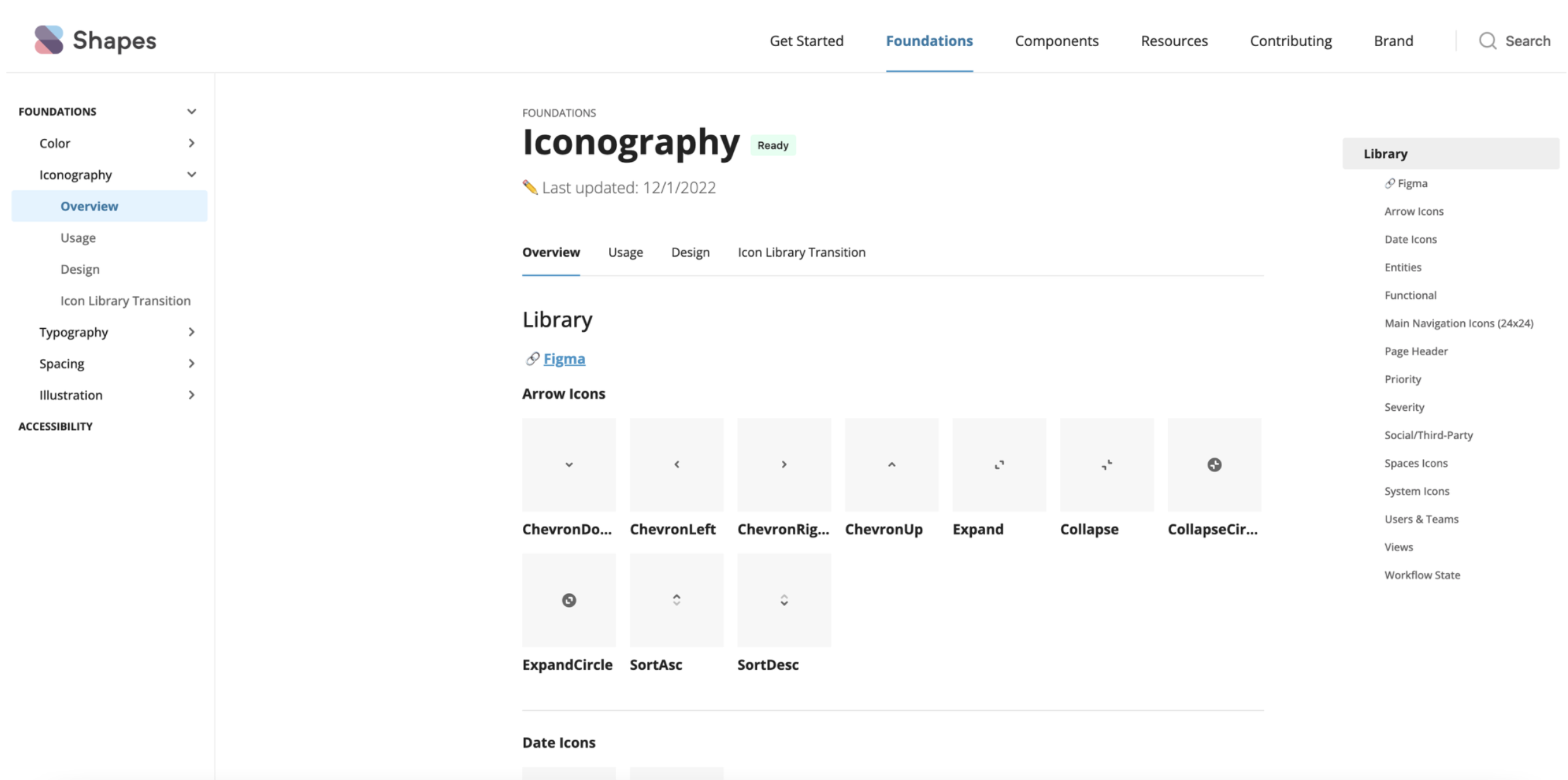
Re-architected iconography, typography, and spacing to create a cohesive, enterprise-grade UI.
Established design-to-code parity, governance, and a reusable React library with engineering.
Drove adoption across product teams through hands-on enablement, QA, and clear system guidance.
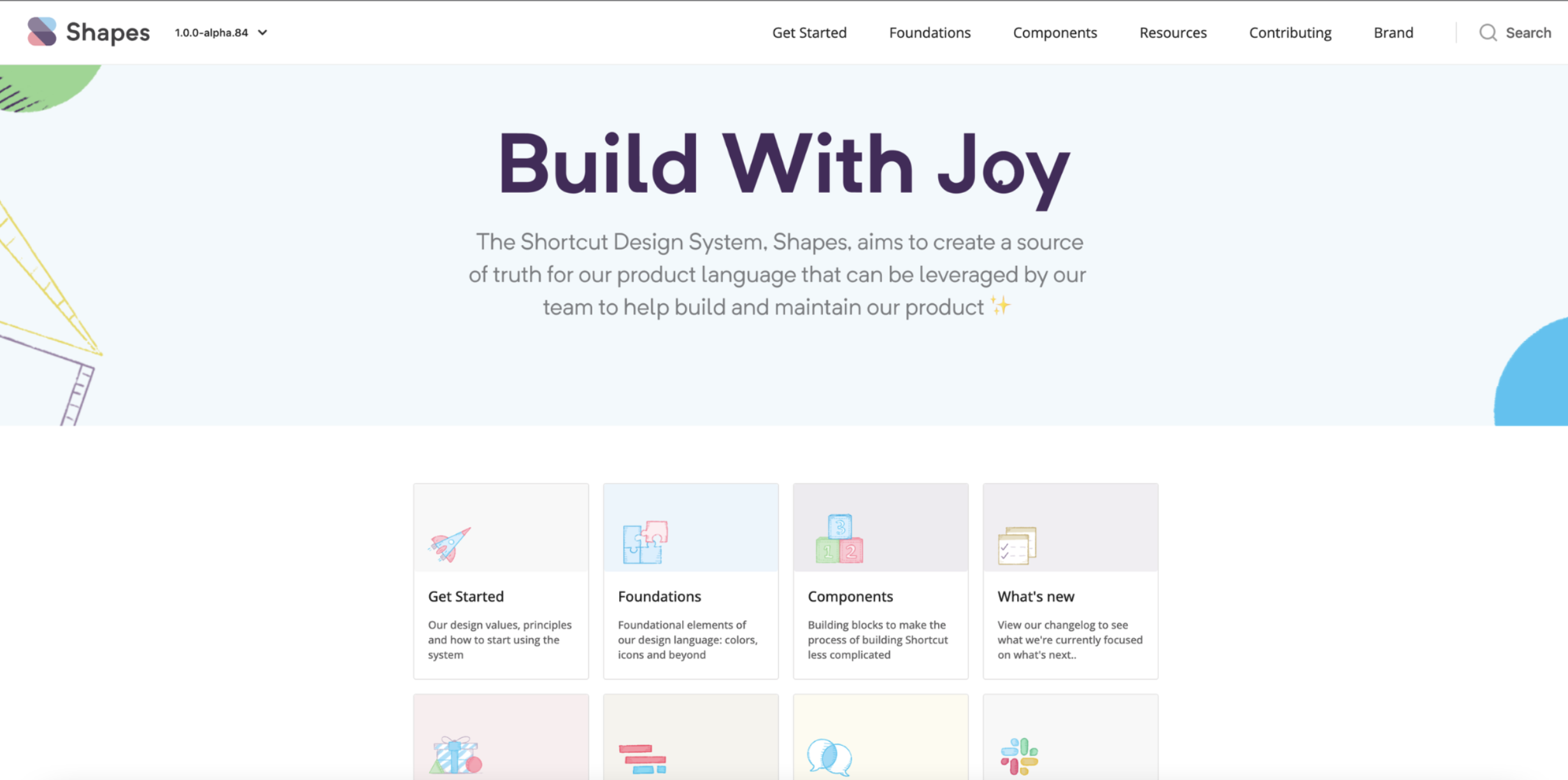
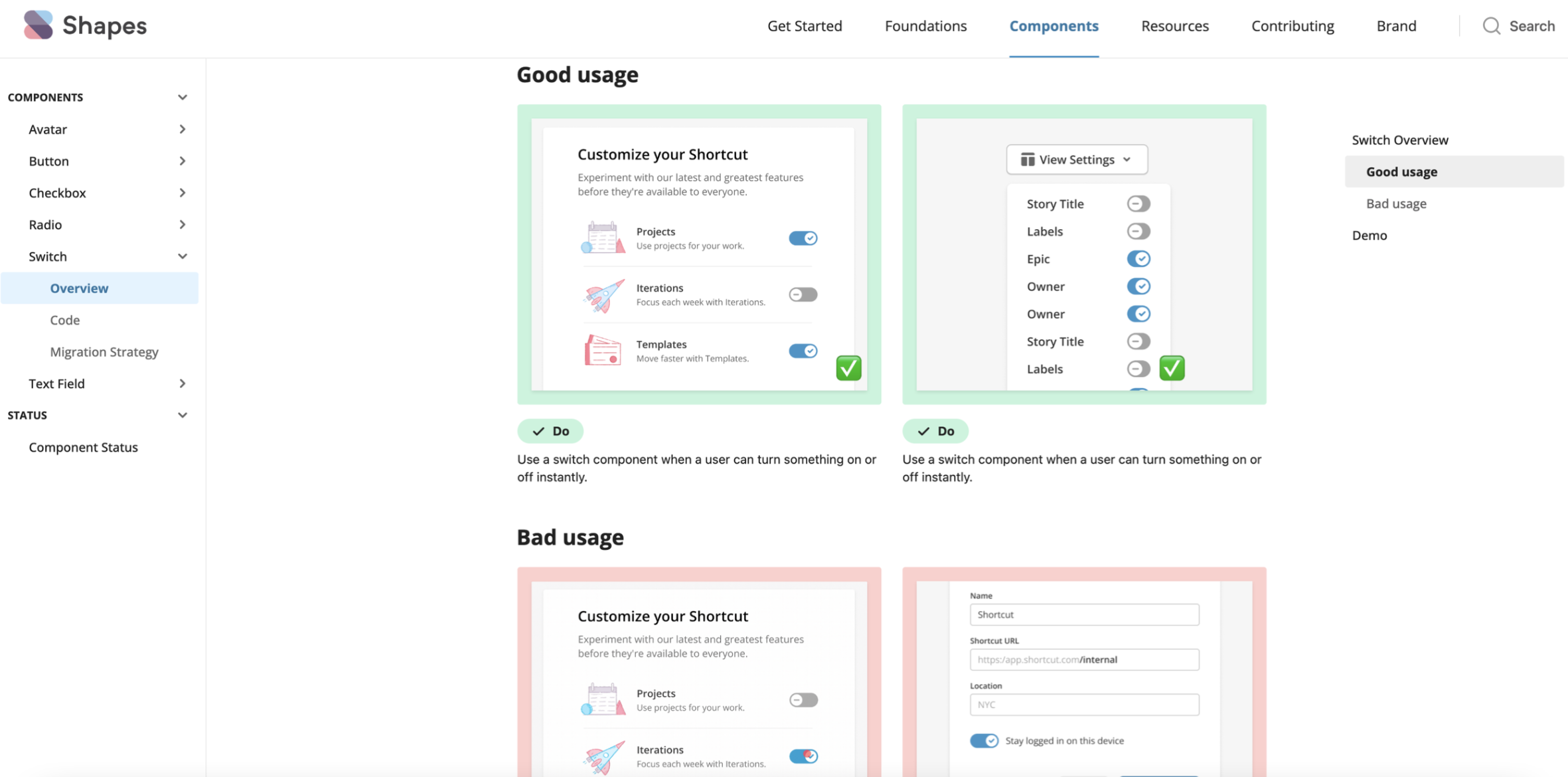
Built a full documentation / reference site with ZeroHeight
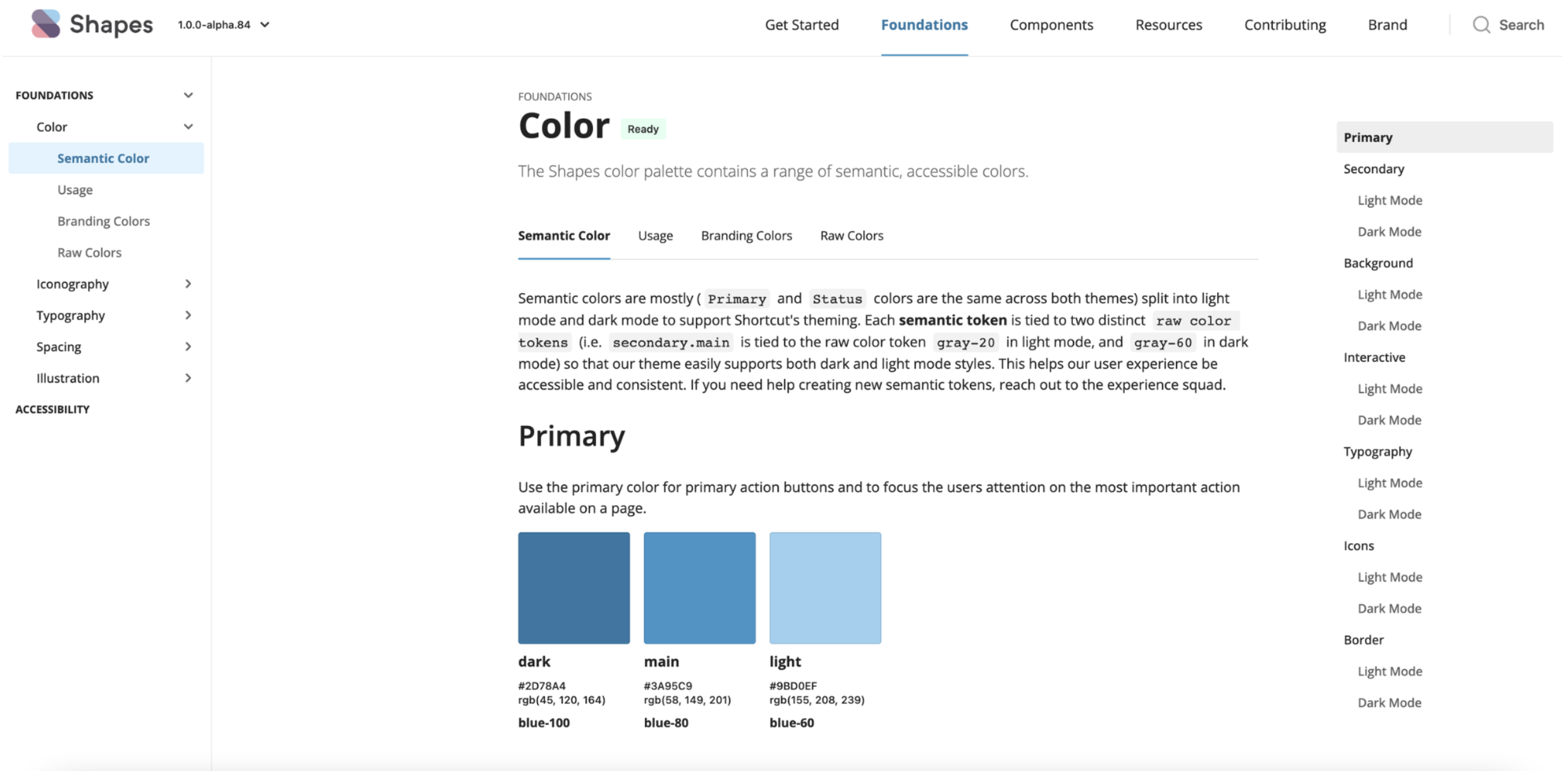
Designed and built a semantic color system to align with the Shortcut brand, with a focus on accessibility
Designed and built a semantic color system to align with the Shortcut brand, with a focus on accessibility
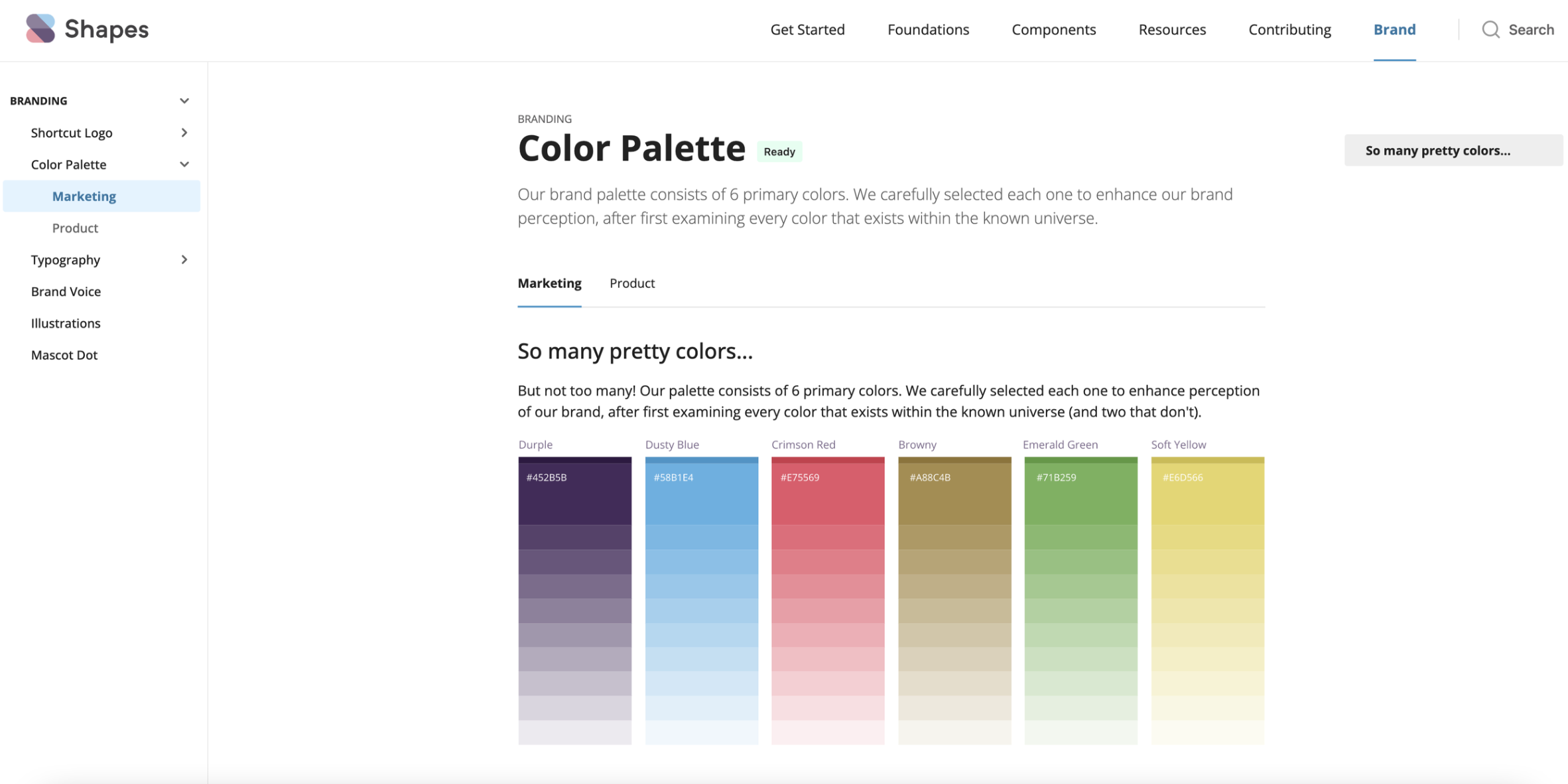
Nested branding assets side-by-side with the product style tokens to ensure consistency
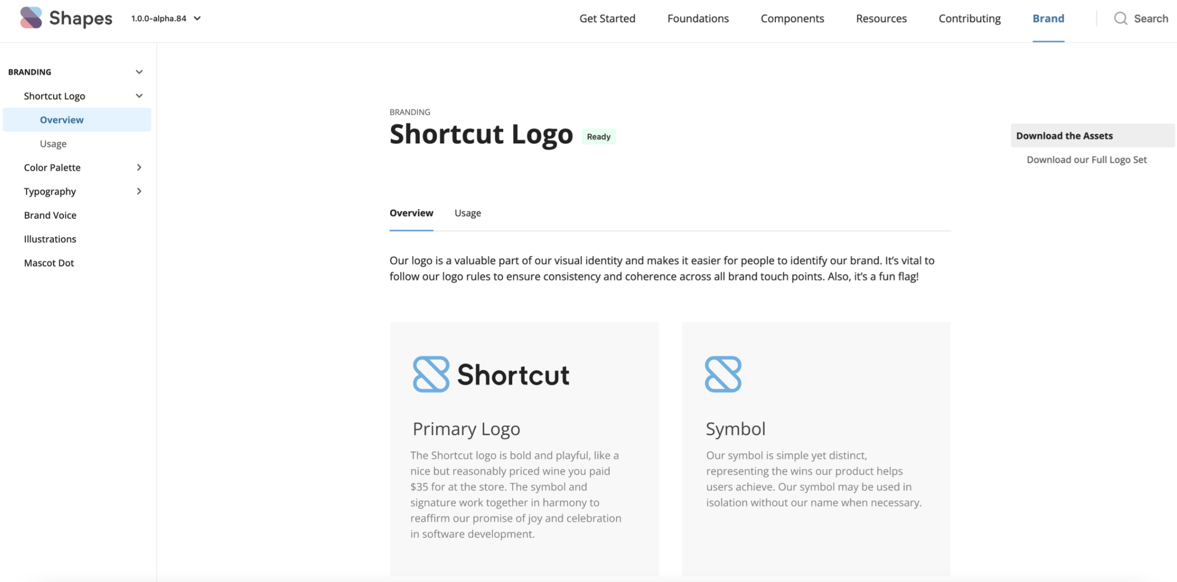
Provided guidance on usage of branding assets and illustrations
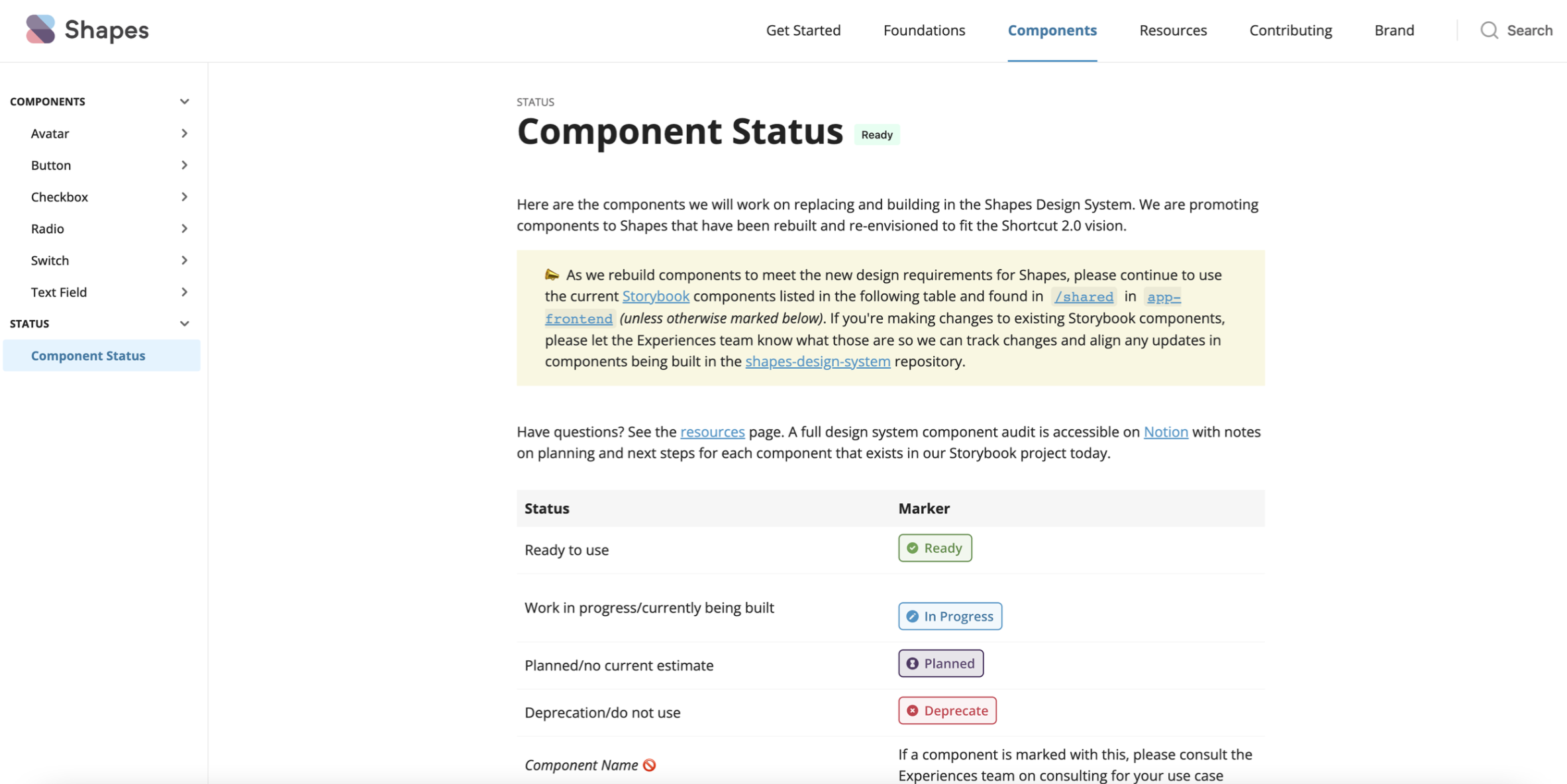
Created a "component status" table to build transparency on rate of delivery of components for use by consuming dev teams
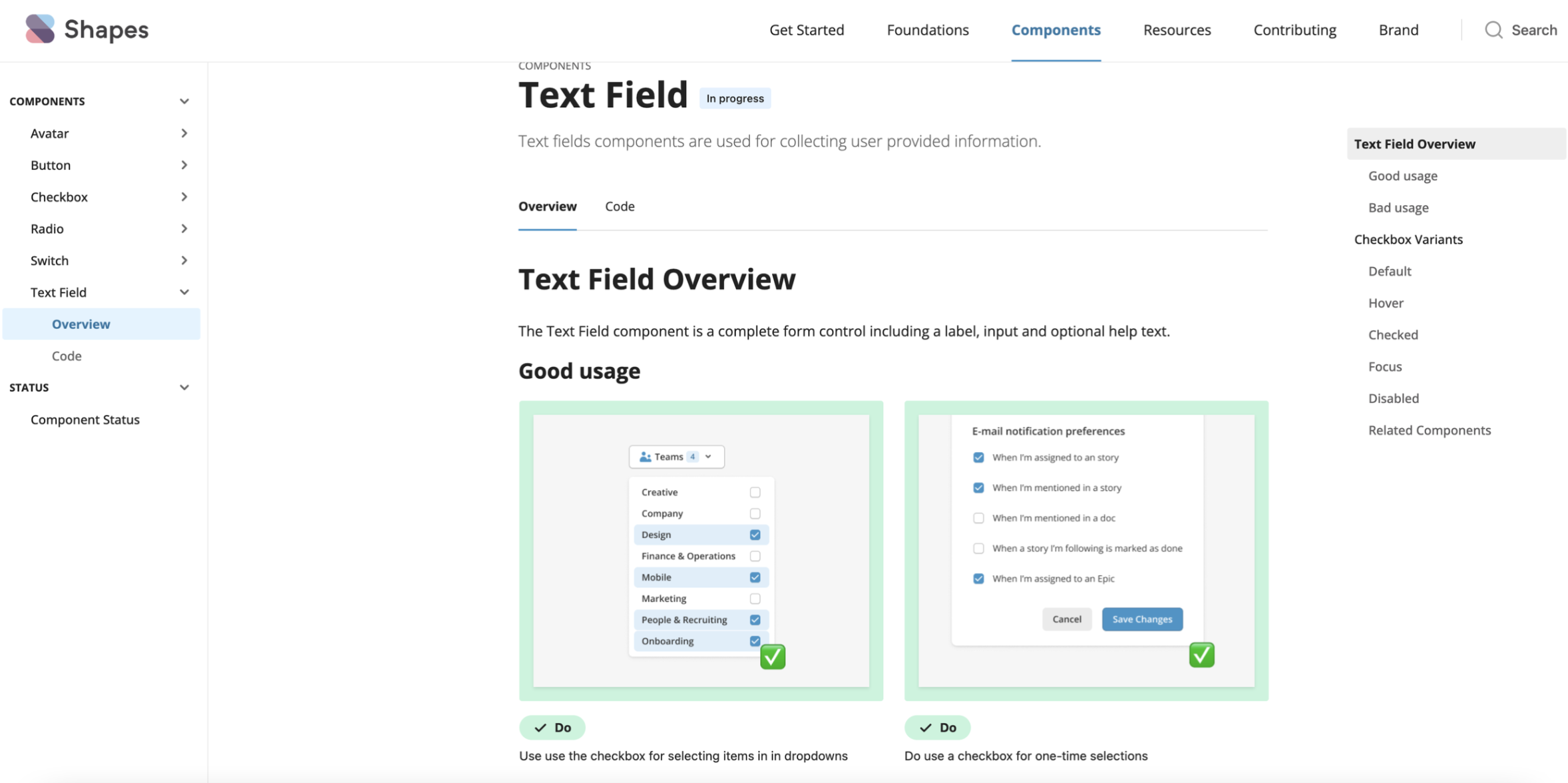
Templated component pages with usage instructions and code demos
Dark Mode
Led the dark mode redesign, introducing semantic tokens and a scalable theme structure for long-term flexibility.
Drove the unified dark mode launch that modernized the product experience and responded to years of customer requests for a better dark mode experience (70% of surveyed users preferred dark mode 😎).
See Release News from Shortcut here.
Design System Driven Onboarding redesign
-
![]()
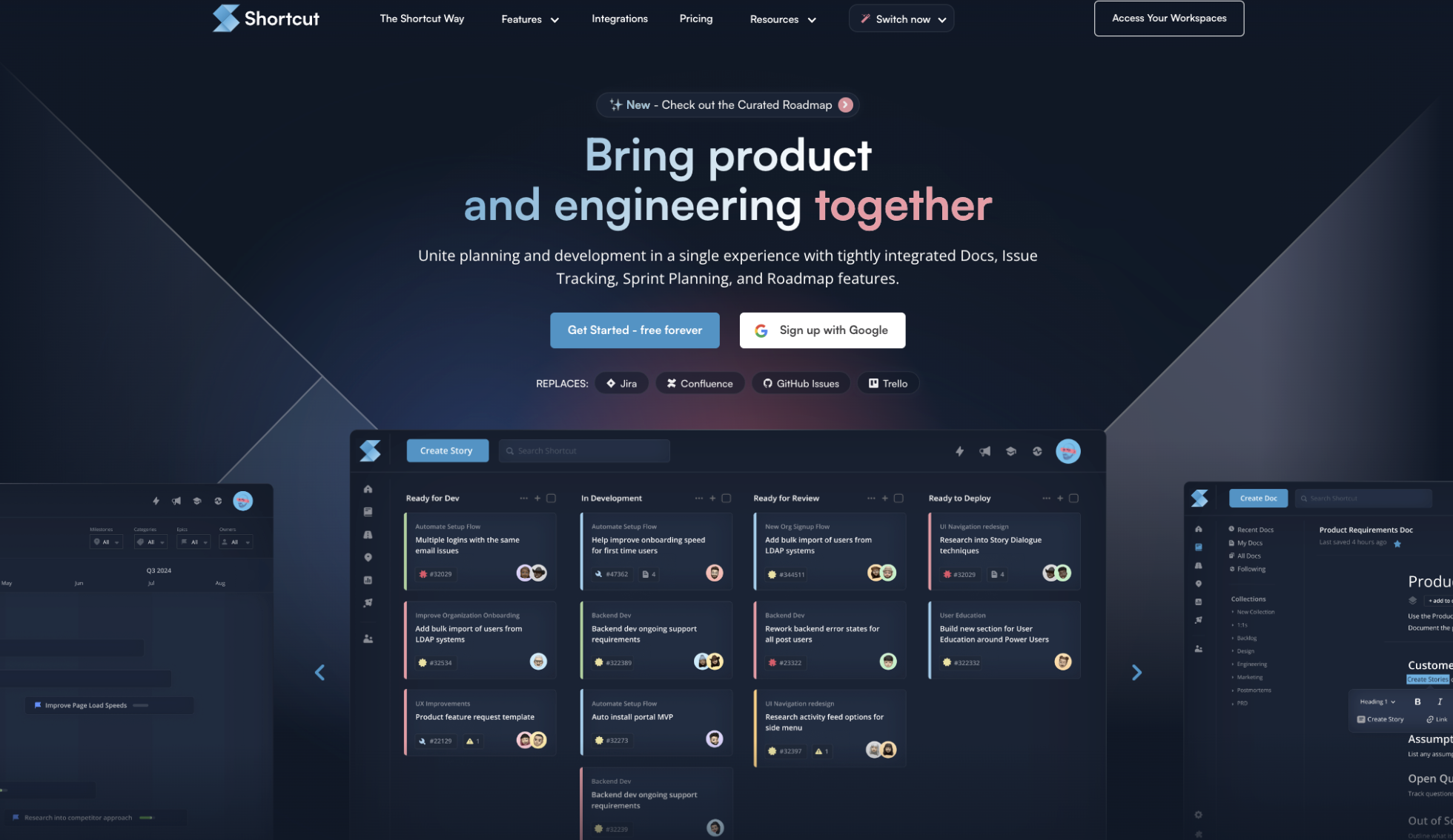
Homepage
Marketing home screen was redesigned with DS foundations
-
![]()
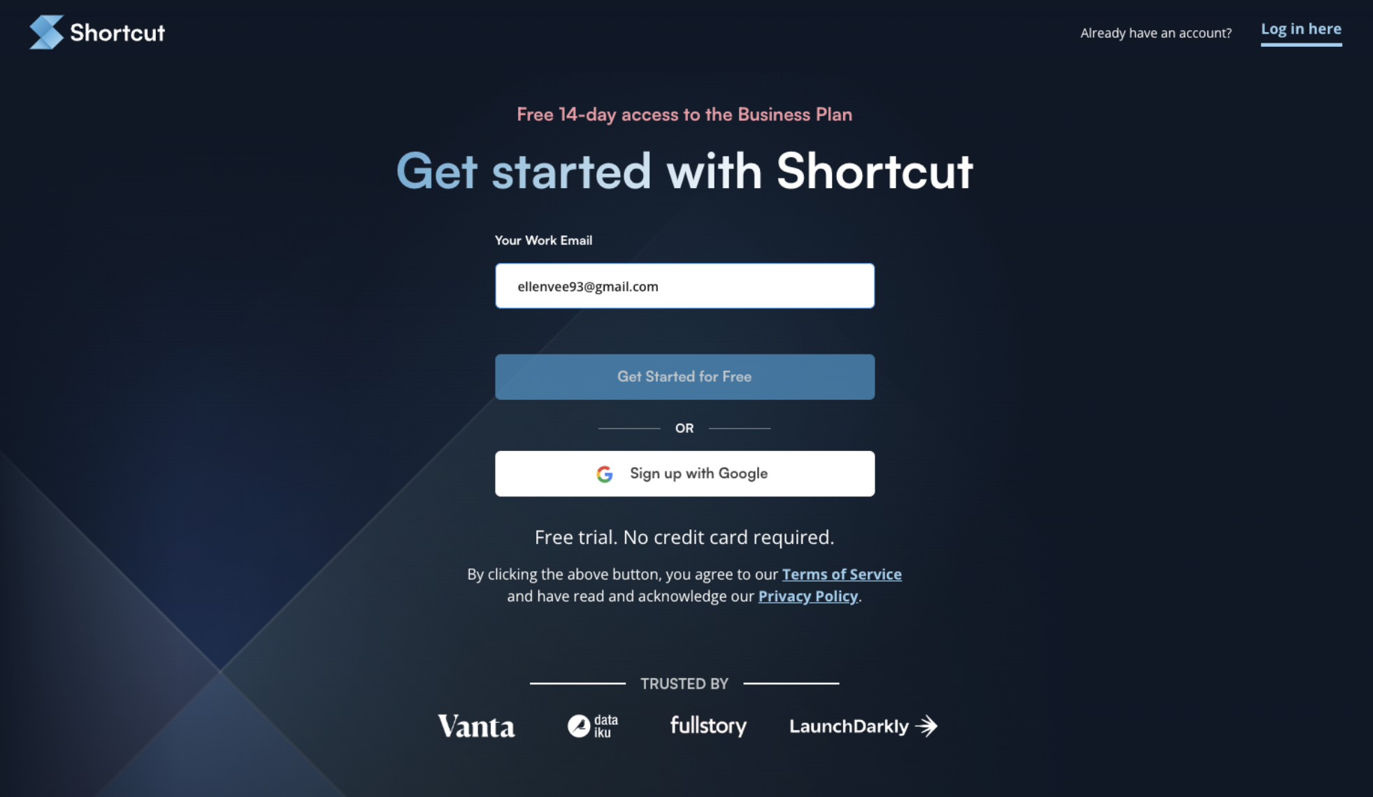
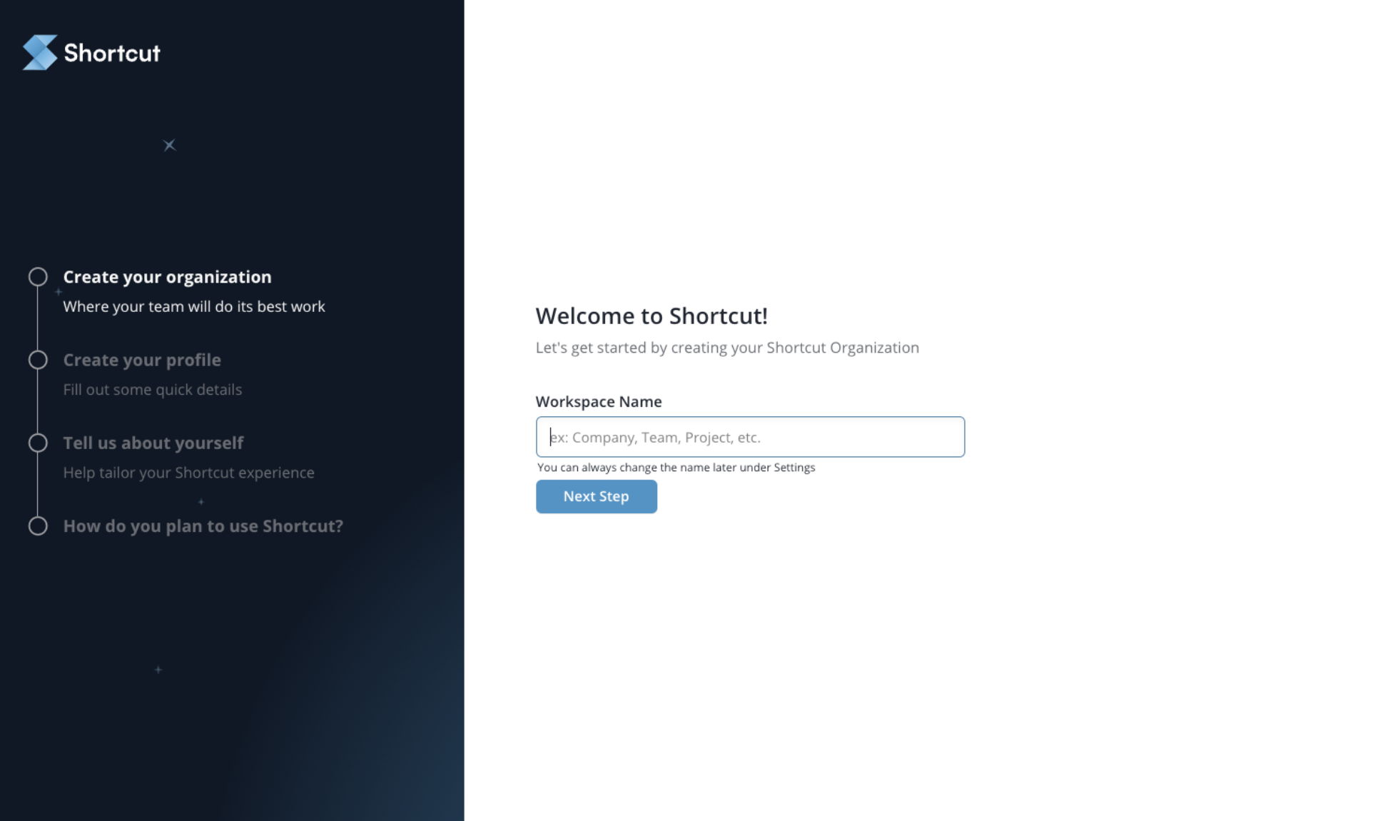
Onboarding Entry
User starts flow here, simple to get started with no paywall
-
![]()
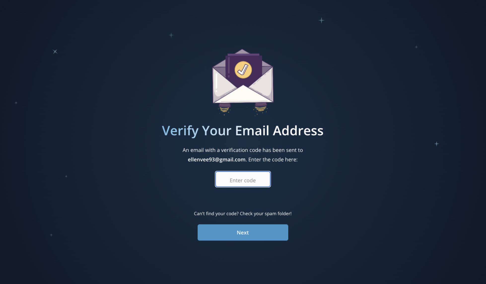
Verification page
Email authentication step
-
![]()
Onboarding flow
Built with a composite component from DS to create a custom onboarding experience
-
![]()
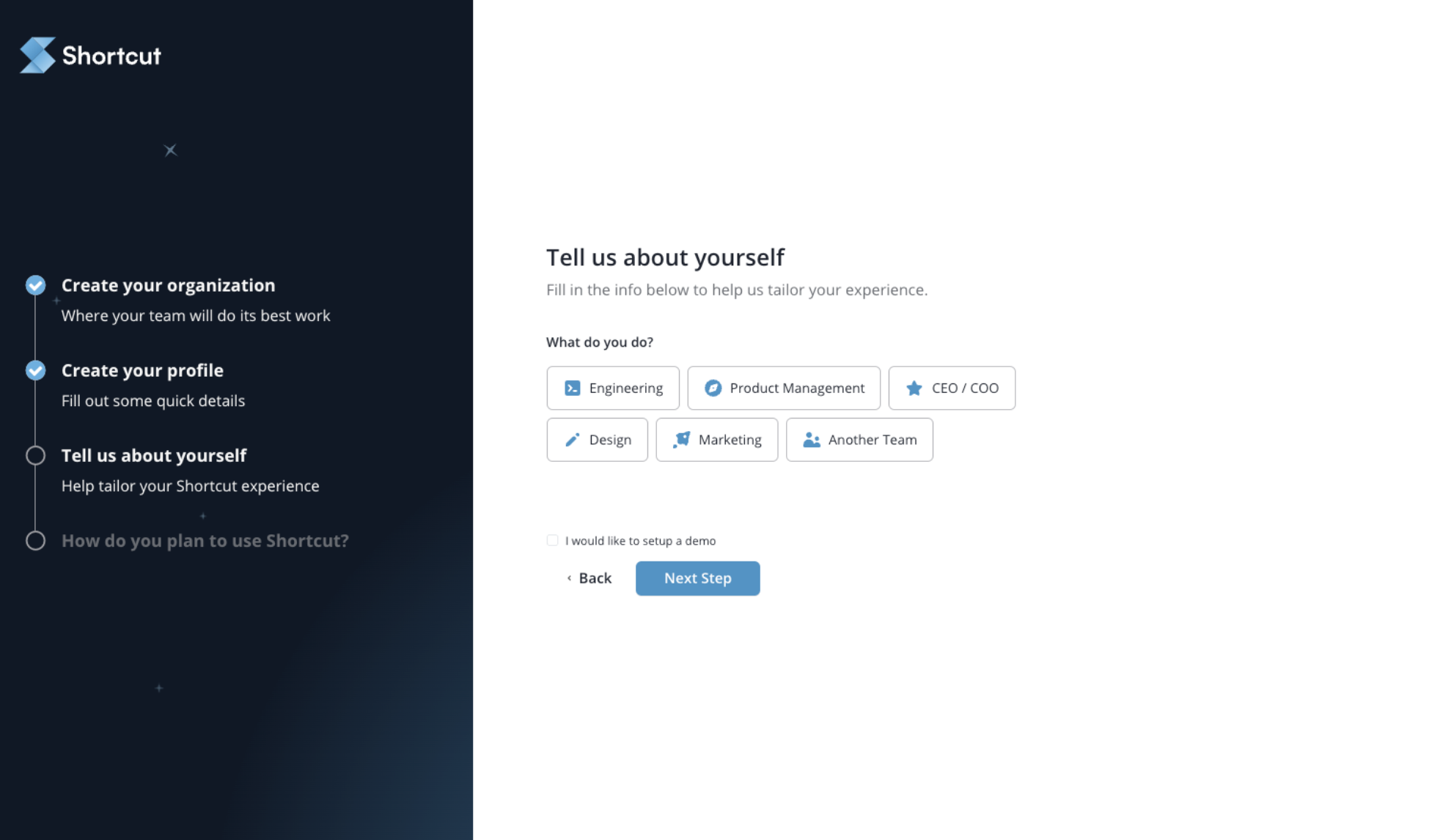
Creating a profile
To gather information on the user's role to optimize in-app education based on given role
-
![]()
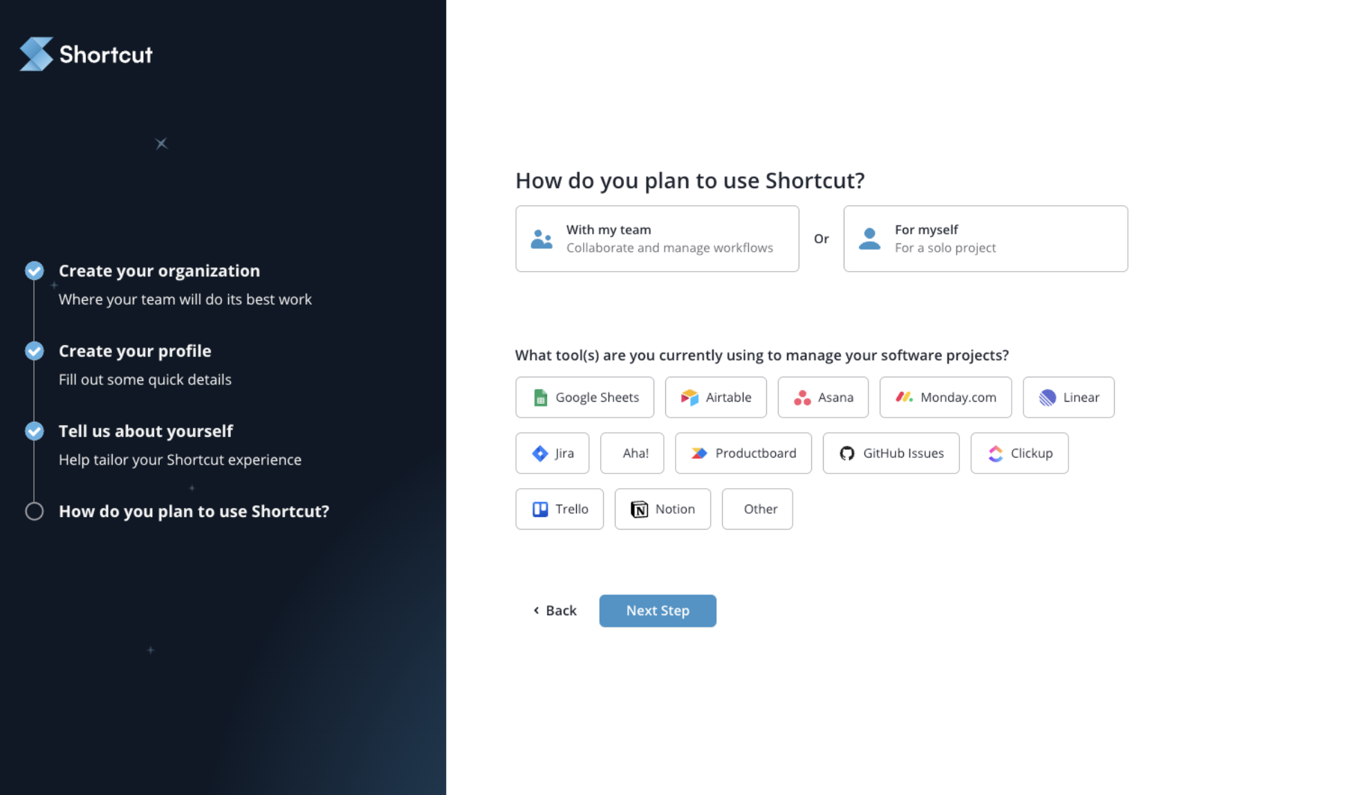
Usage goals
Gathering information on intentions from user and to get rollover data from other tools/services
-
![]()
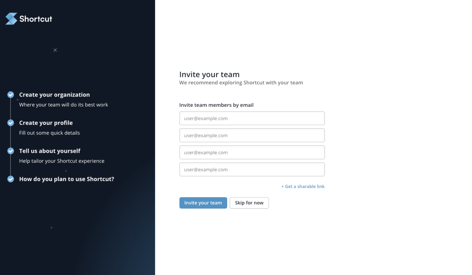
Invite screen
Invite teammates to join workspace
-
![Homepage]()
Homepage
Transition to Shortcut application with custom setup guide and help content generated from flow
Impact
Established Shortcut’s first true Design System, creating a modular design language and the foundation for all future design work.
Enabled engineers to ship UI ~40% faster through reusable, well-documented components and clear design specs.
Reduced UI inconsistencies across the product, consolidating patterns into a unified source of truth built on atomic design principles.
Introduced a scalable dark-mode architecture, unlocking modern theming and long-term maintainability.
Improved accessibility across the app, with accessible color contrast, iconography, and component behaviors.
Reduced duplicated engineering effort, cutting down on re-building the same UI patterns and speeding product delivery.
Reflection
Shapes was a transformative, ground-up systems project that reshaped how Shortcut designed, built, and shipped product experiences. Working as a team of one, I learned to balance strategy, systems thinking, and execution to create a durable foundation the company could scale on for years.
Because I was both the designer and one of the primary users of the product, I had a unique opportunity to dog-food the system daily, continuously validating and improving patterns in real time. The work accelerated Shortcut’s design maturity and pushed its design language forward years ahead of schedule.