At Zscaler, I led system architecture, documentation strategy, and emerging tooling integrations. I created scalable Figma libraries, component standards, documentation, and governance models that ensured Nimbus could grow sustainably across multiple product teams.
Team Size
7
Role
Principal Designer | Manager
Company
Zscaler
Year
2025
Building Zscaler’s Design System
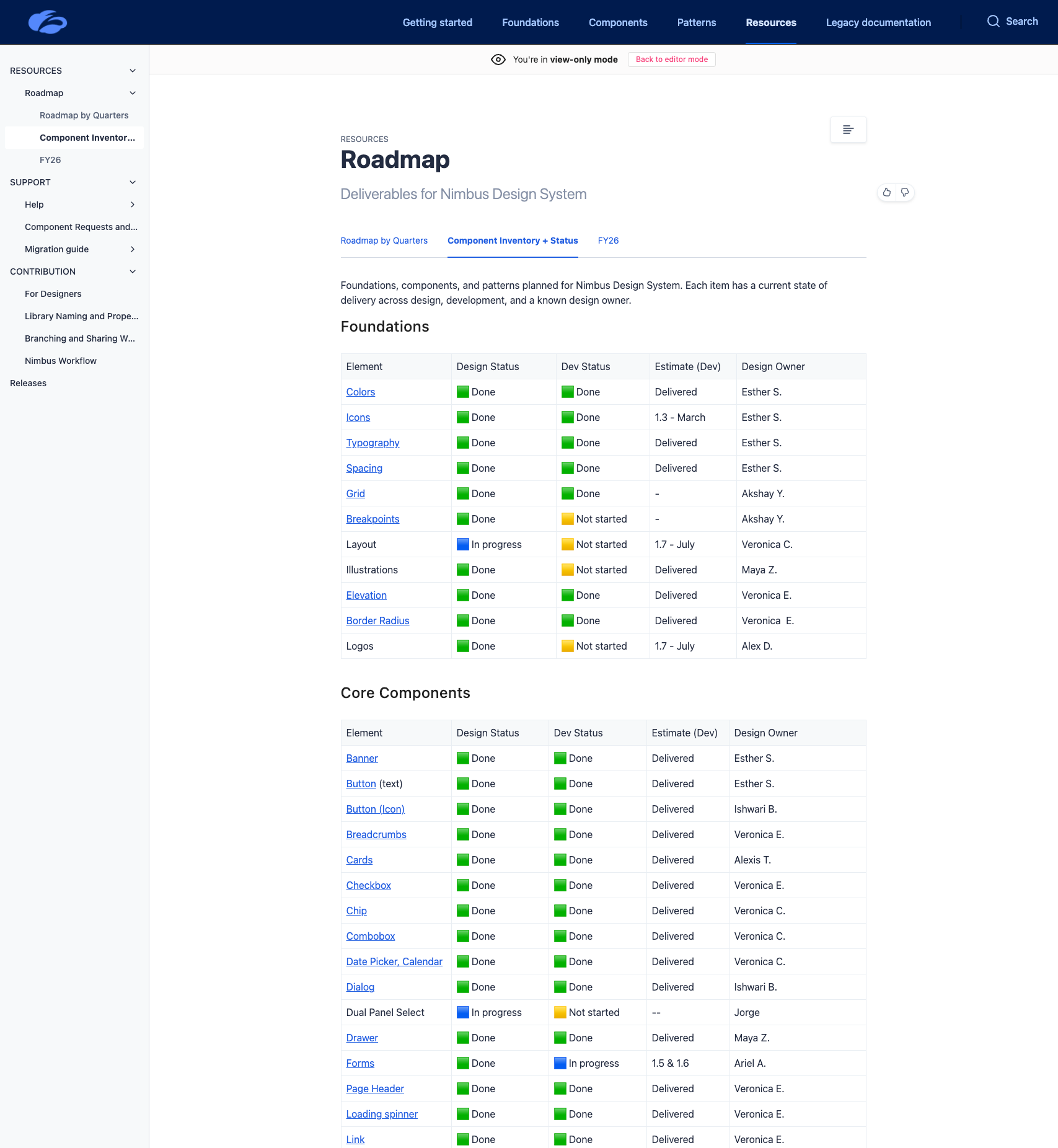
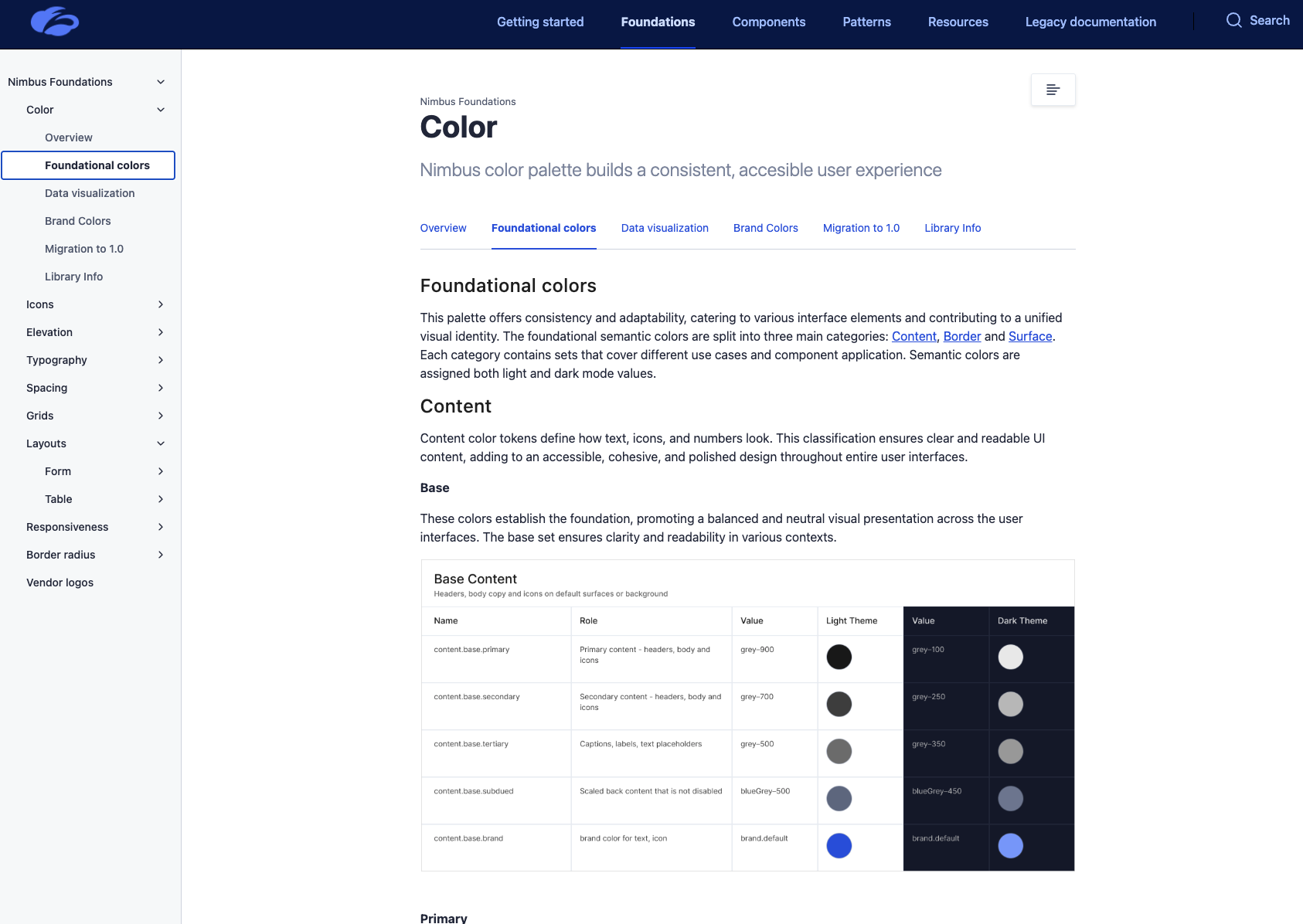
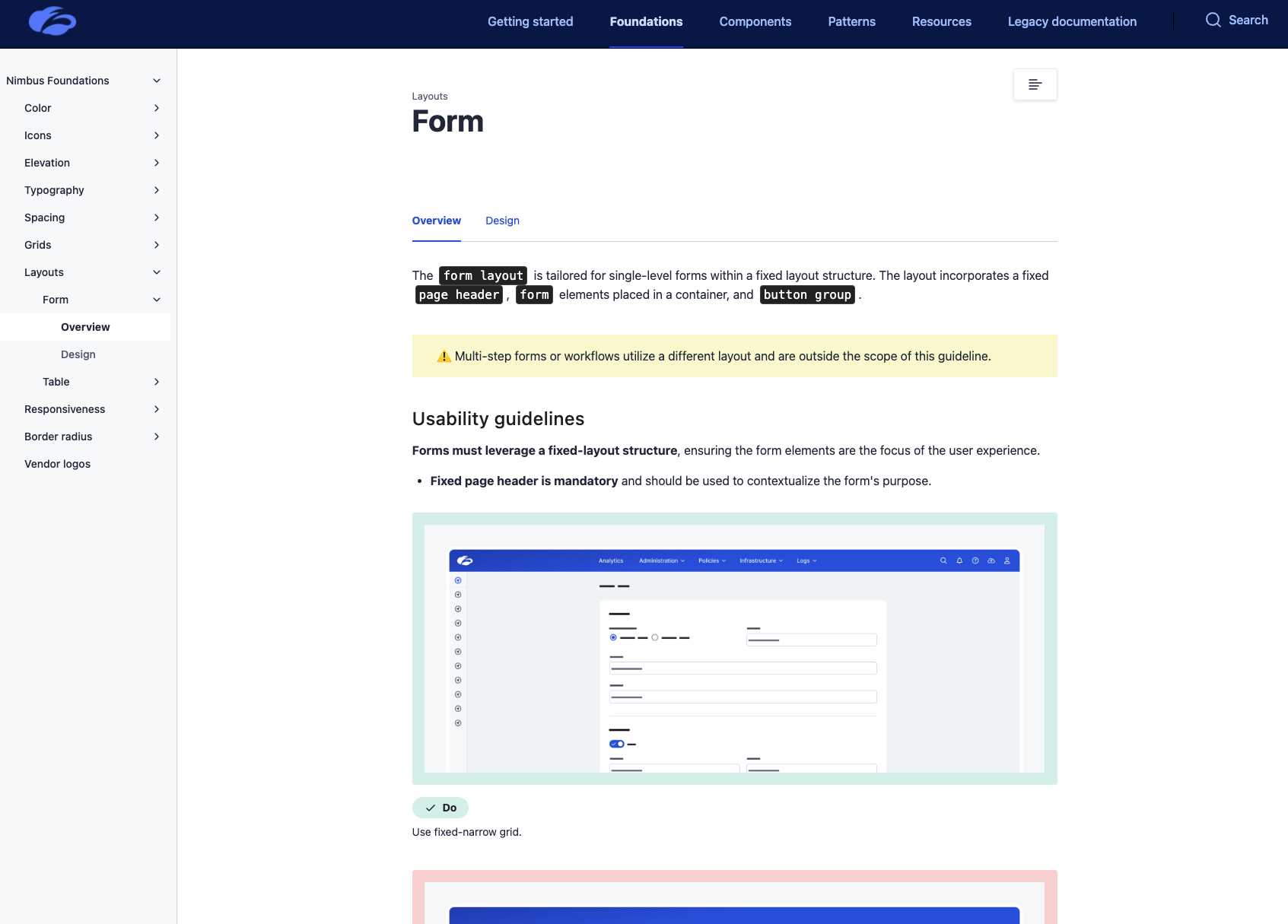
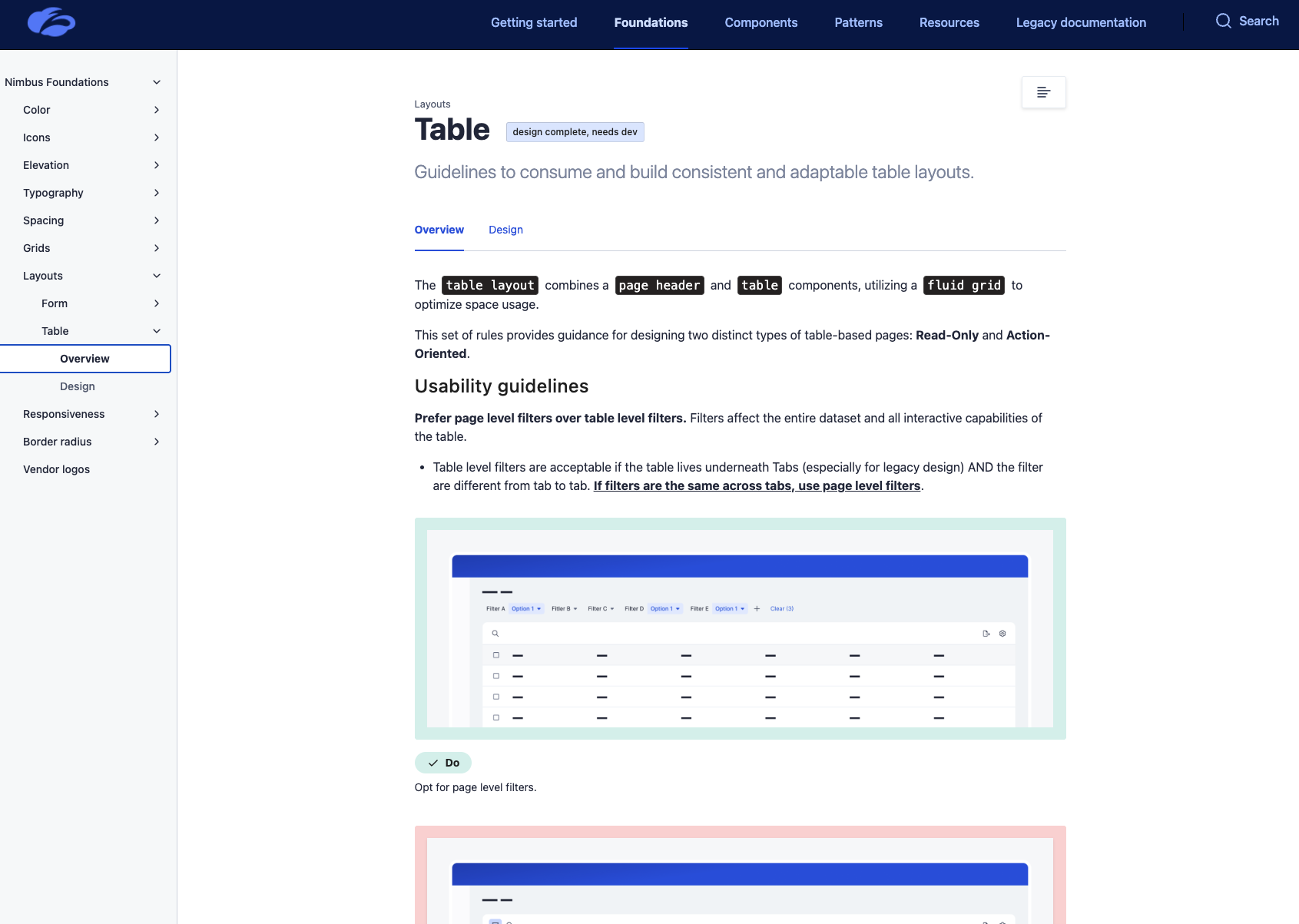
I created the end-to-end system our teams use to design and ship components: structured Figma templates, built-in guidance for properties and variants, and a clean workflow for documentation and handoff. By linking everything to Zeroheight, designers and engineers finally have one place to find the right component, understand how to use it, and implement it correctly. Check out a small sample of design system foundations, core components, patterns and data visualizations below.
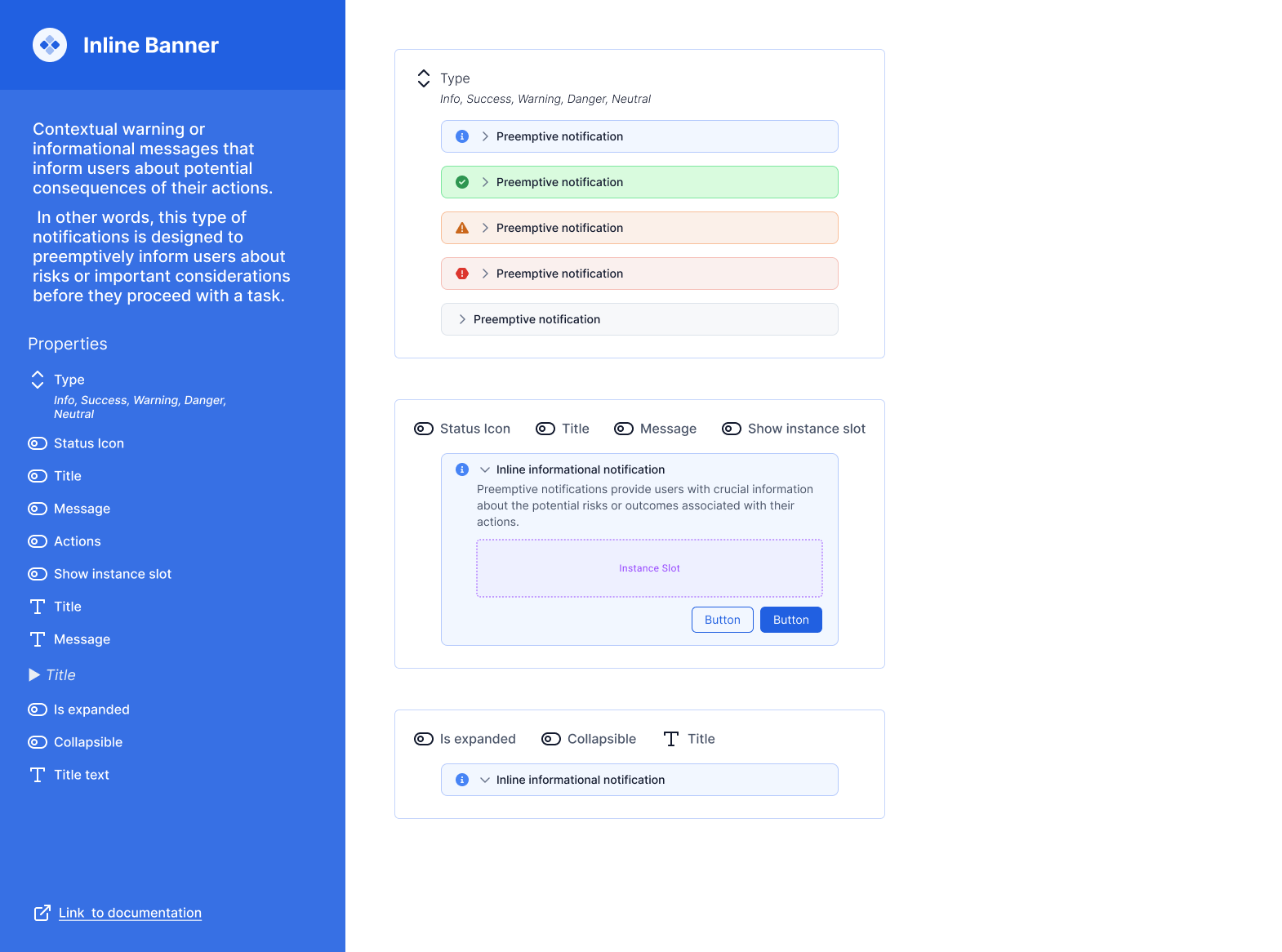
Inline Banner Component
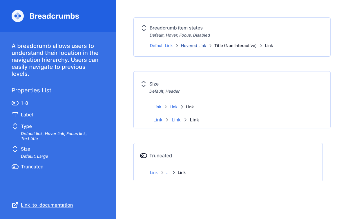
Breadcrumbs
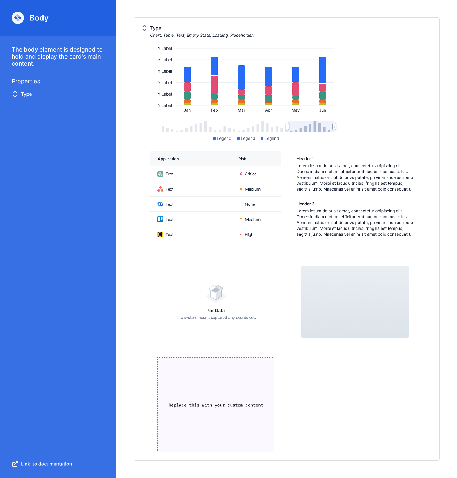
Composable Card, Body Module
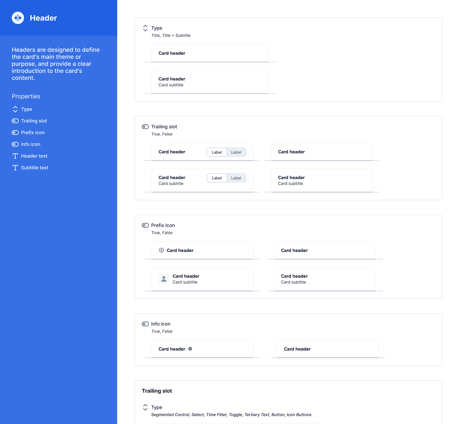
Composable Card, Header Module
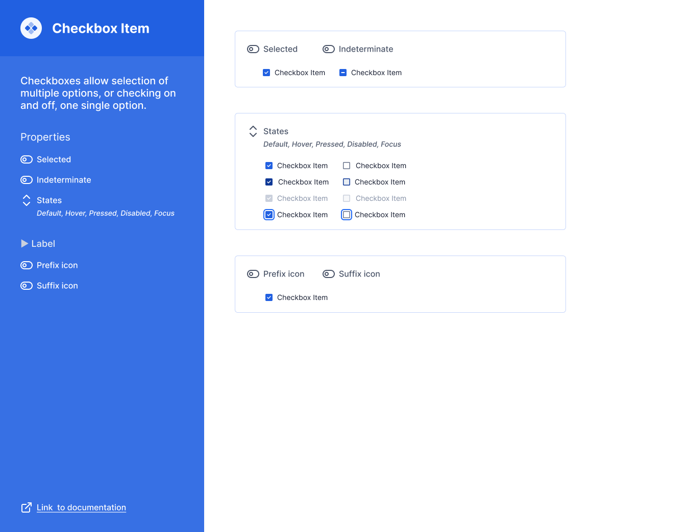
Checkbox atom
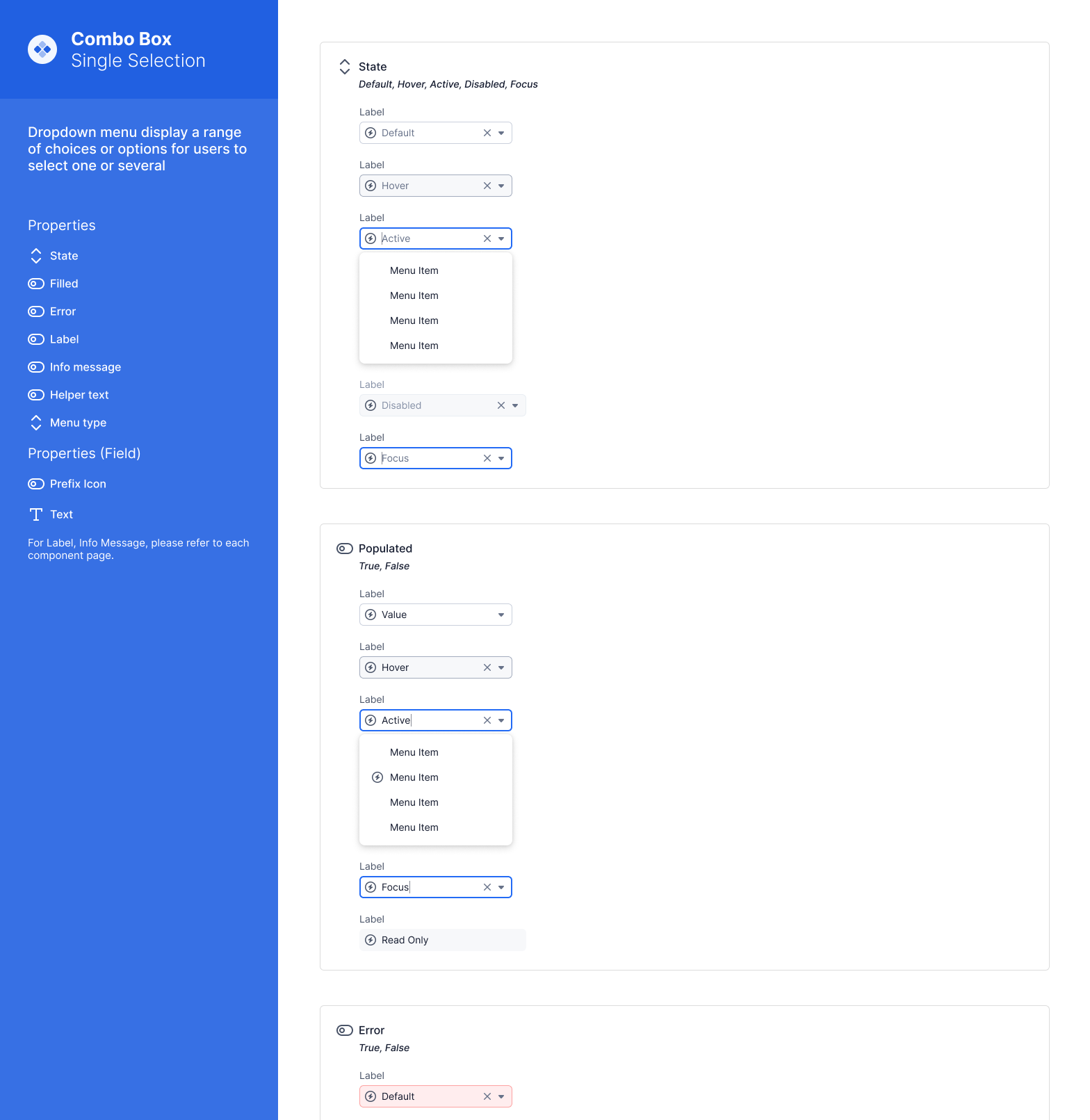
Combobox, Input Component
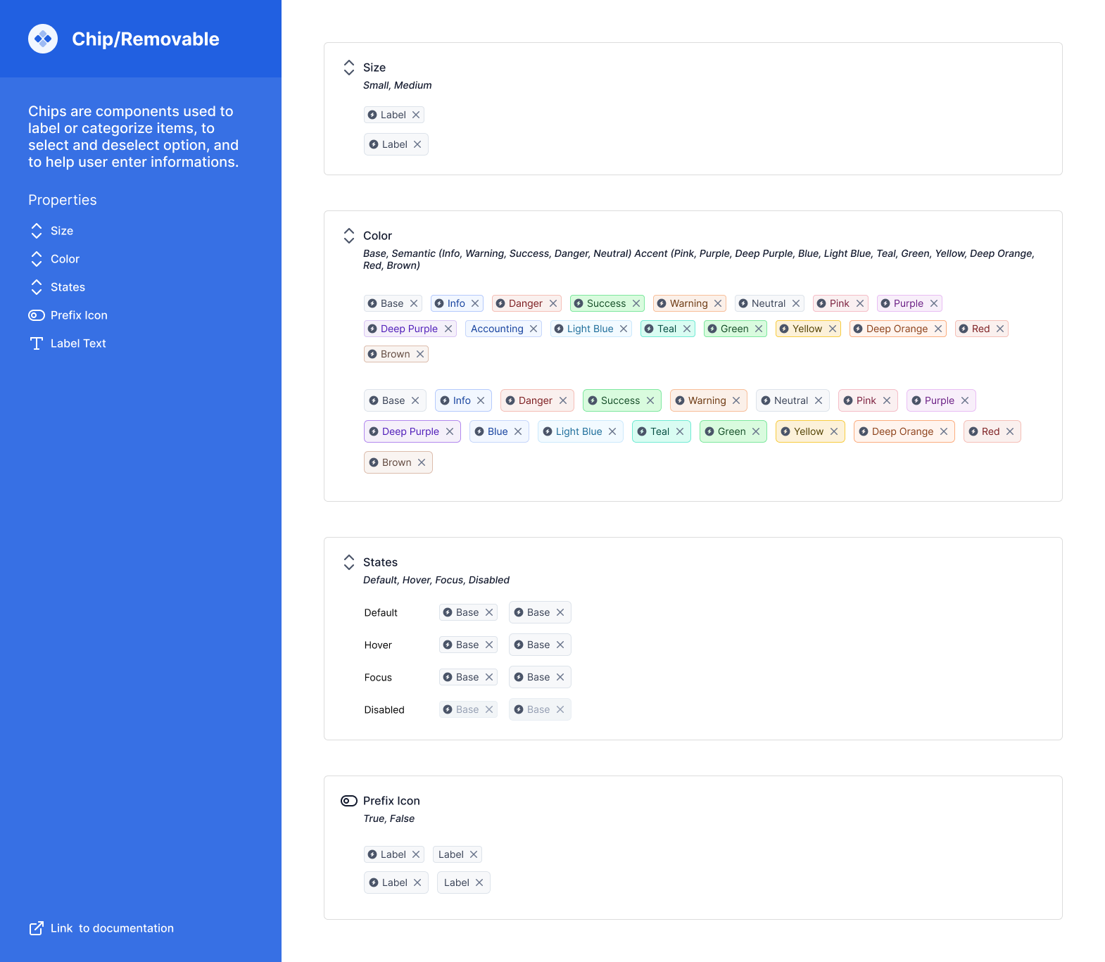
Chip, Data Display Component
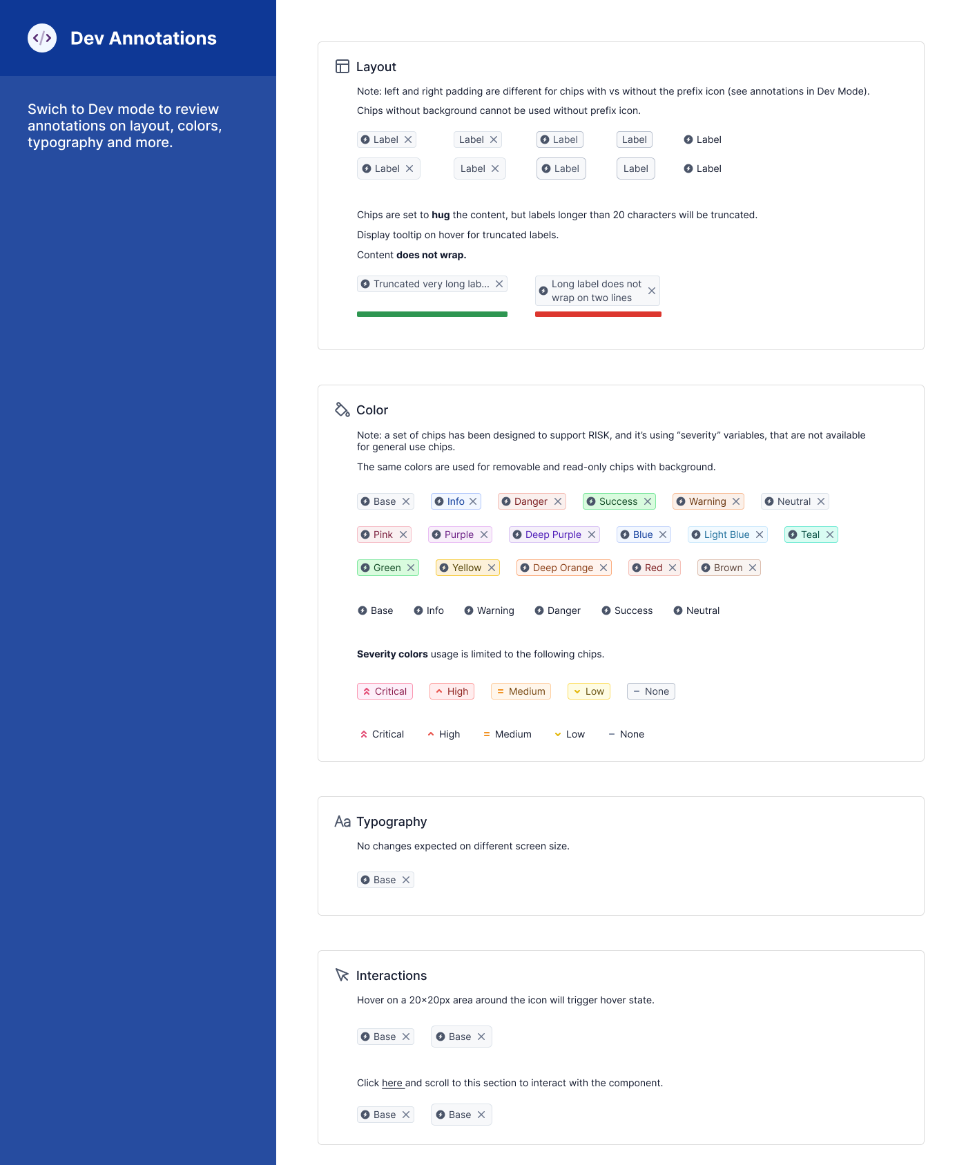
Dev Annotation Example for Chip
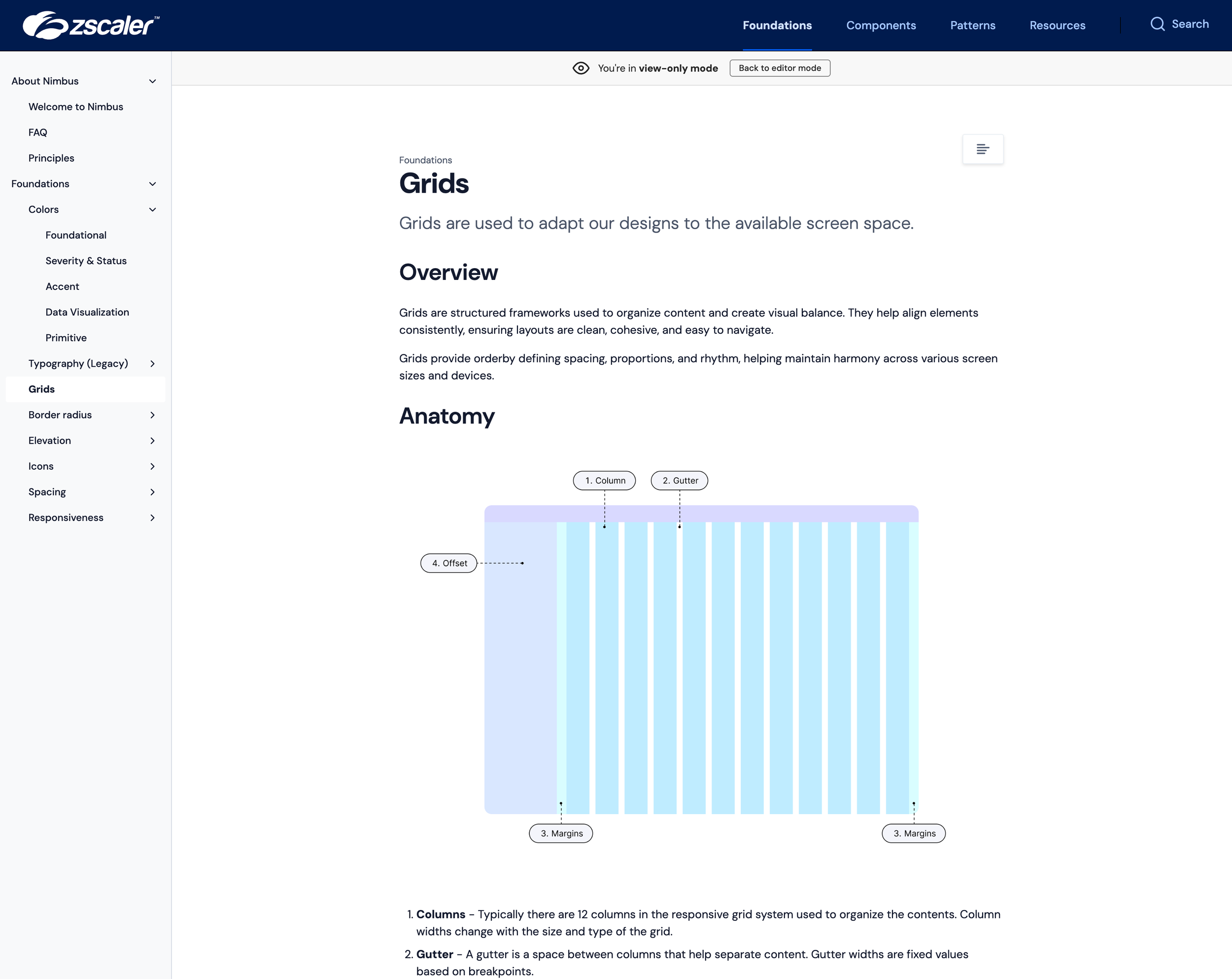
Foundational Layout using Figma's Grid
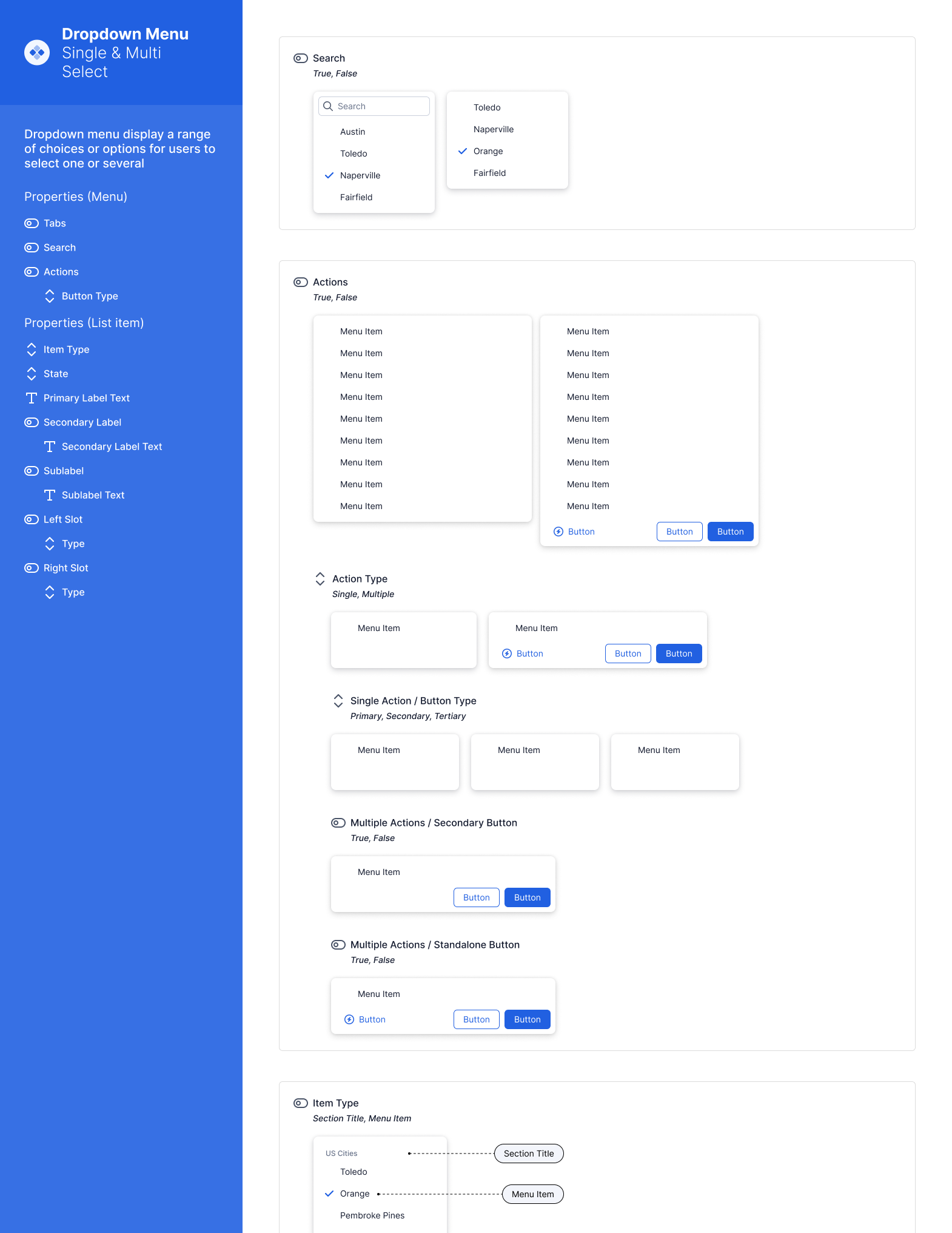
Dropdown Menu, Atoms for Composing Dropdowns
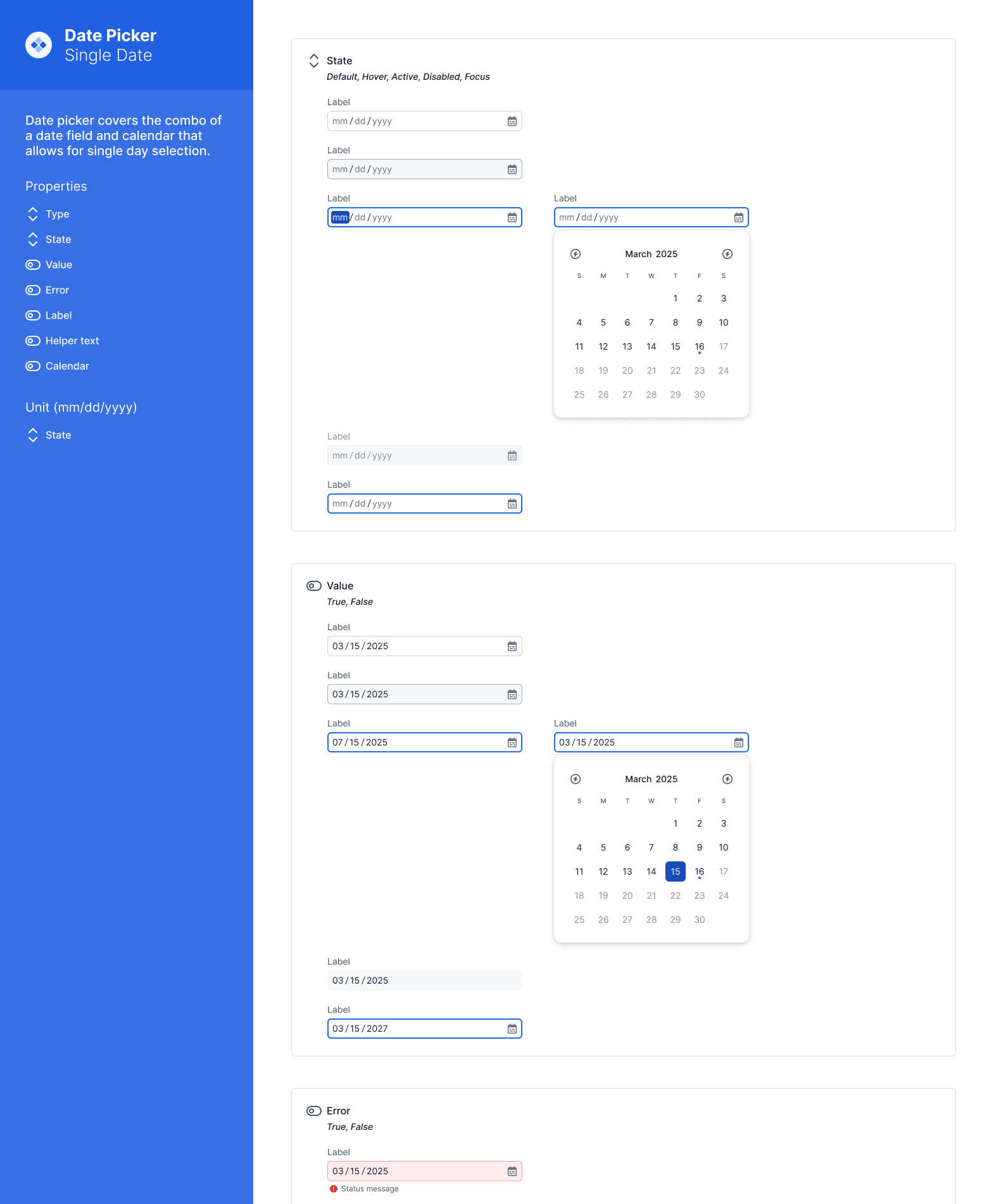
Date Picker for a single date
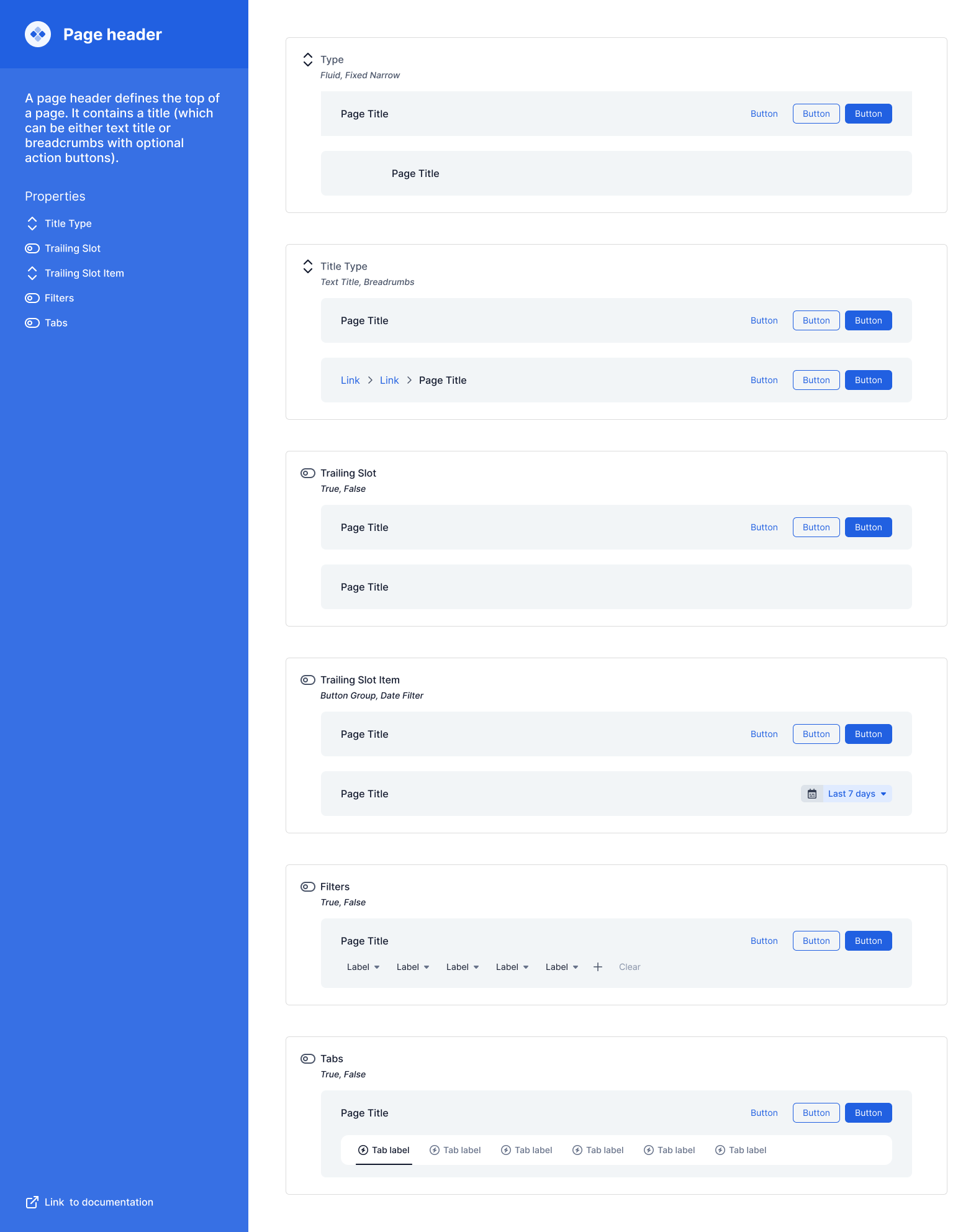
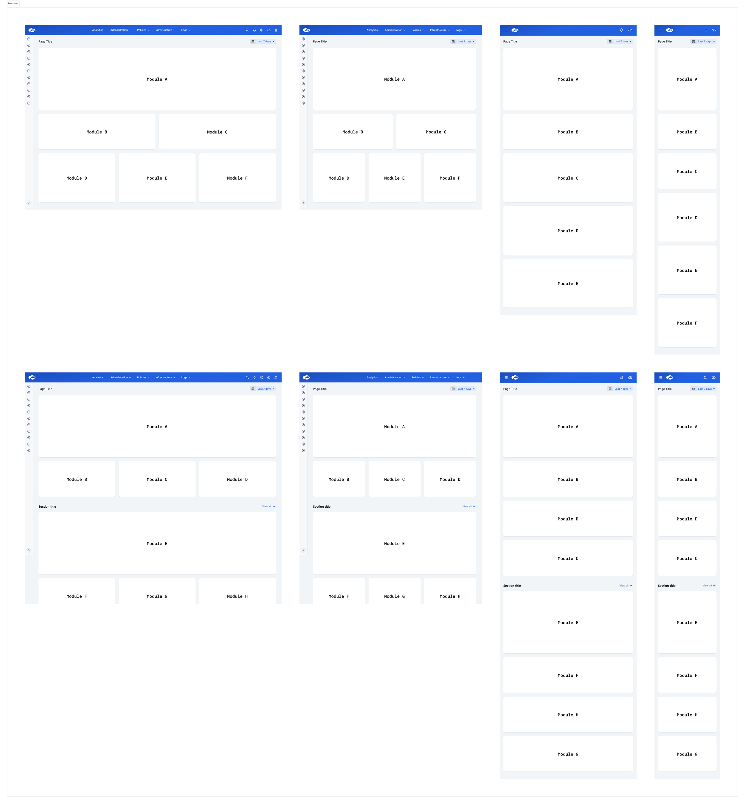
Page Header, consolidating 20+ disperate legacy patterns into one single pattern
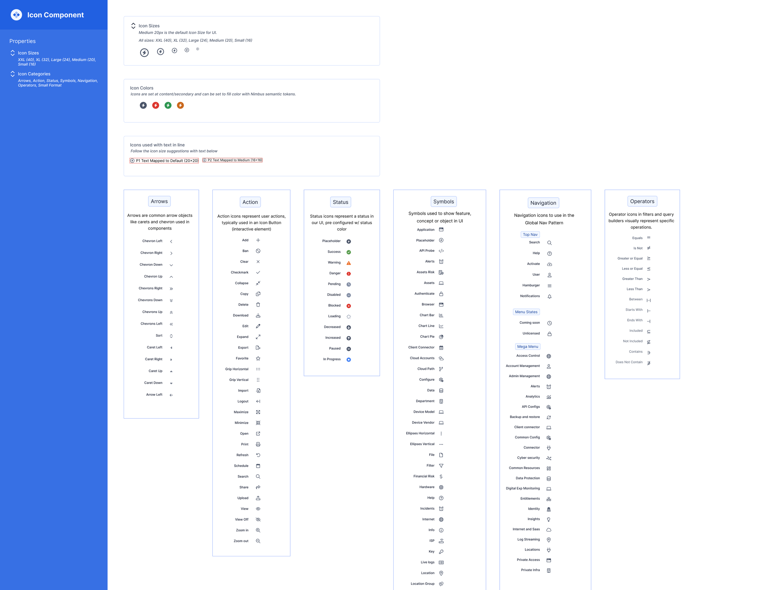
New Icon System, icons built in React (moved away from Font Awesome)
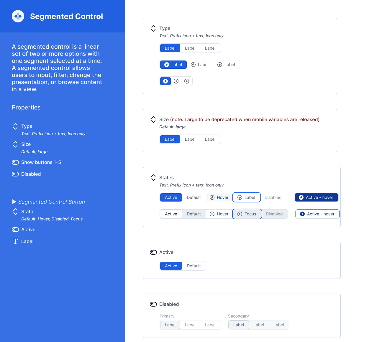
Segmented Control for Forms/Selection
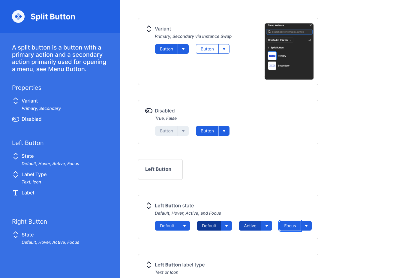
Split button
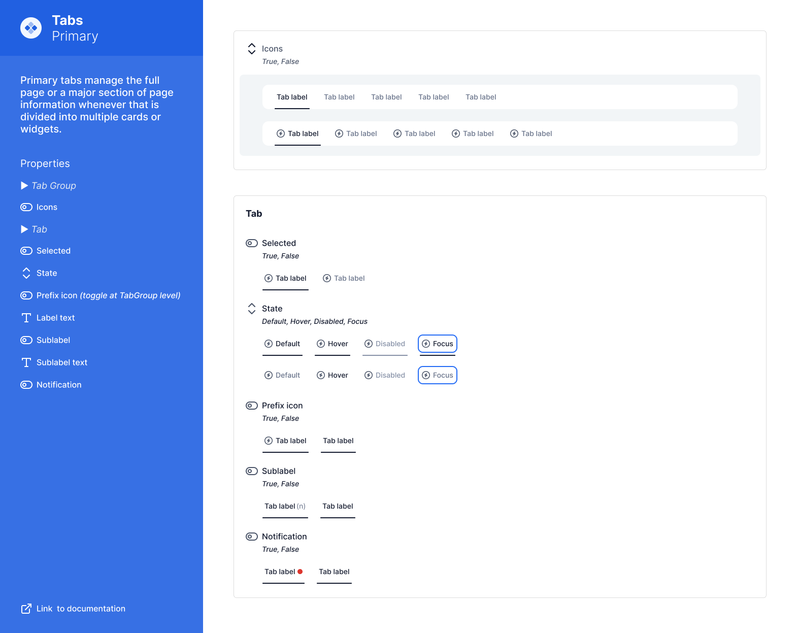
Tabs, built for navigation
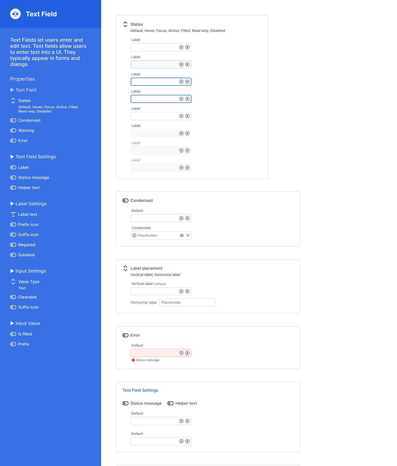
Text Field, one of the Input Fields
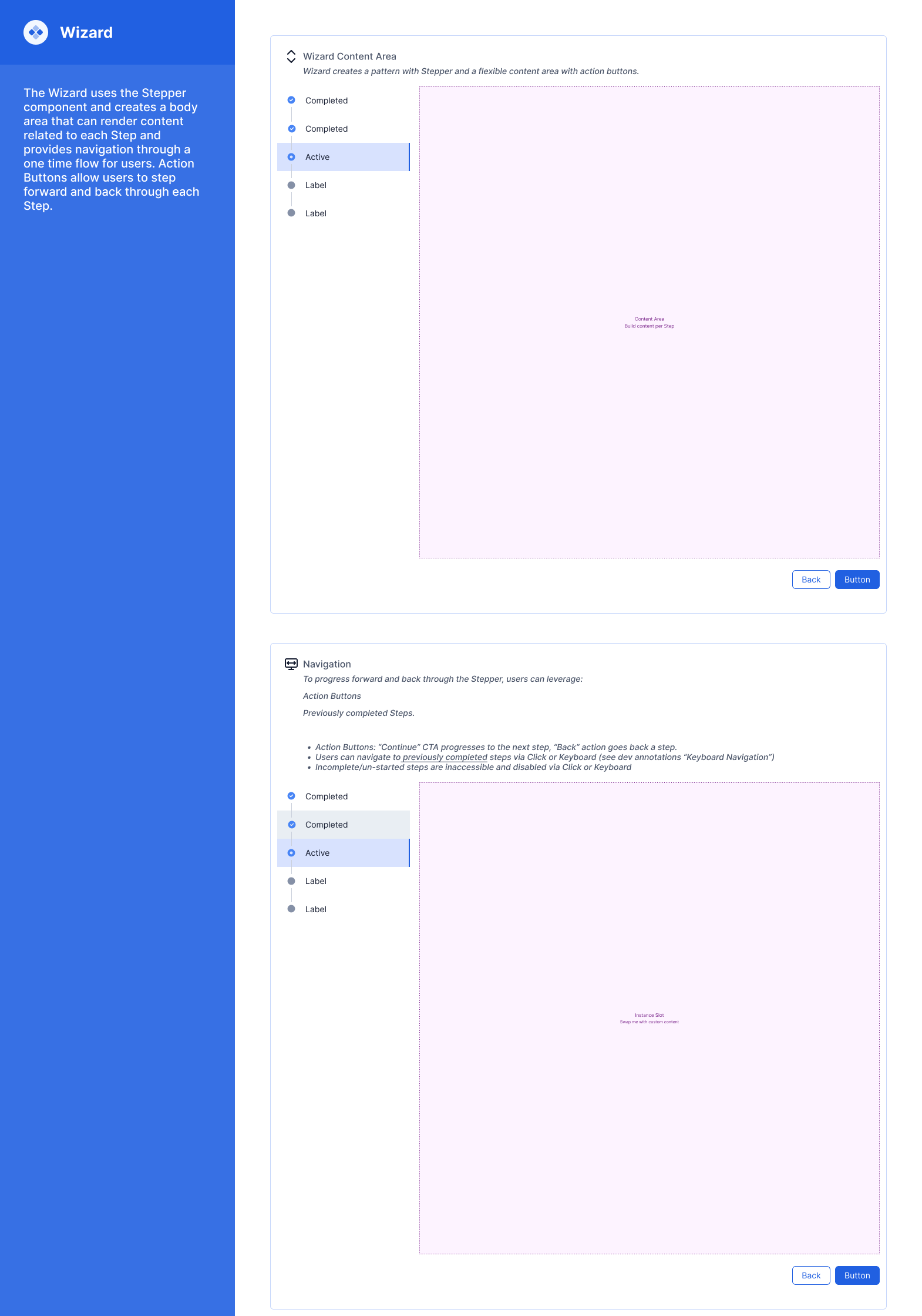
Wizard, using Slots for configurability
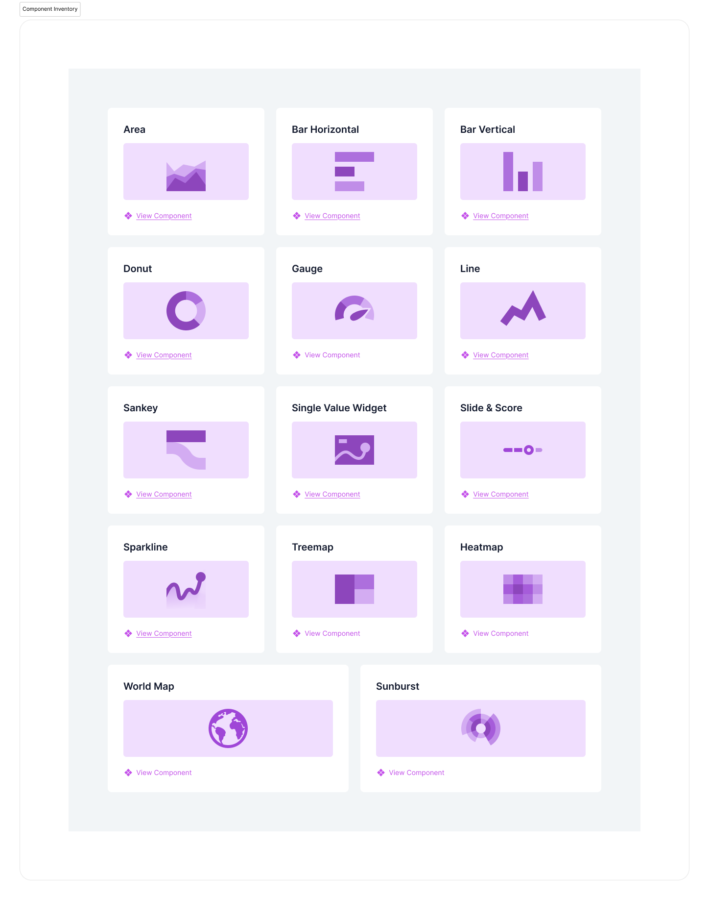
Data Viz Initiative link/launch pad (to keep a big group of contributors sane)
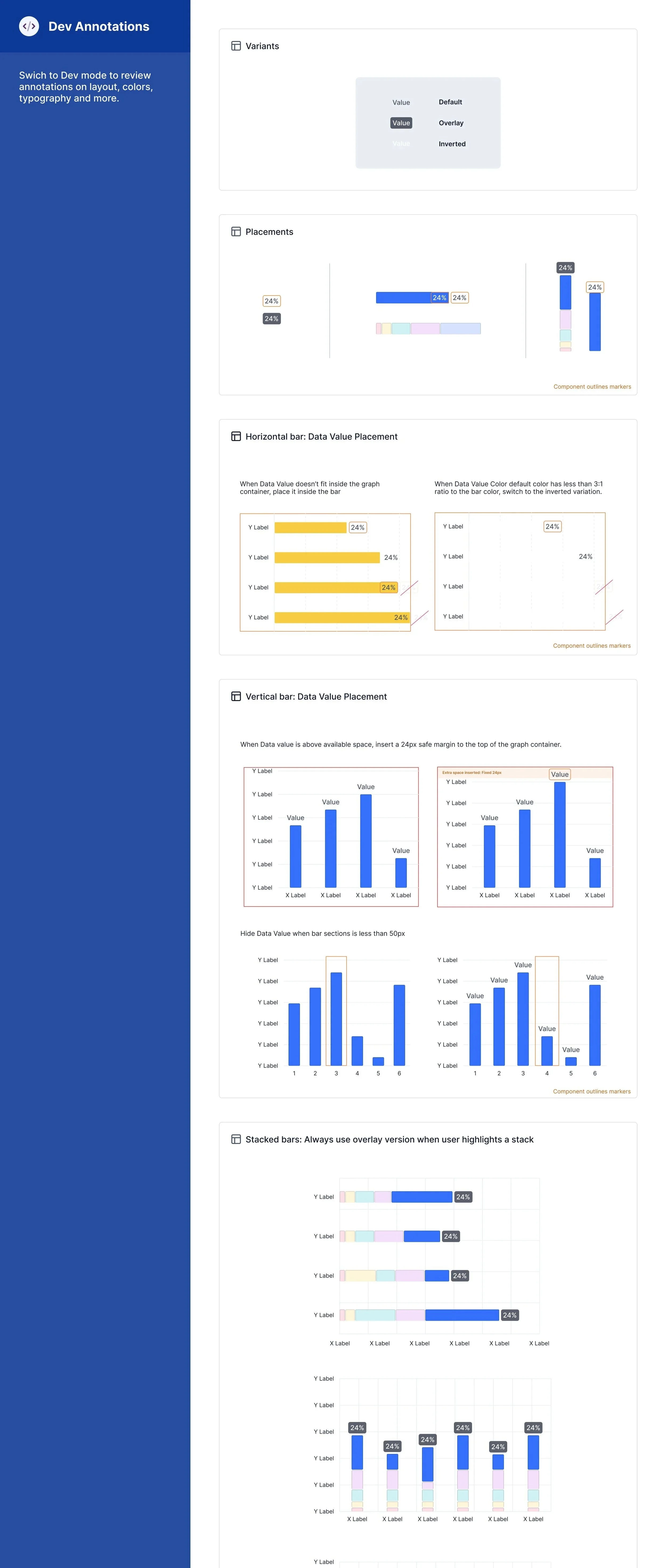
Dev Annotation for Data Viz elements
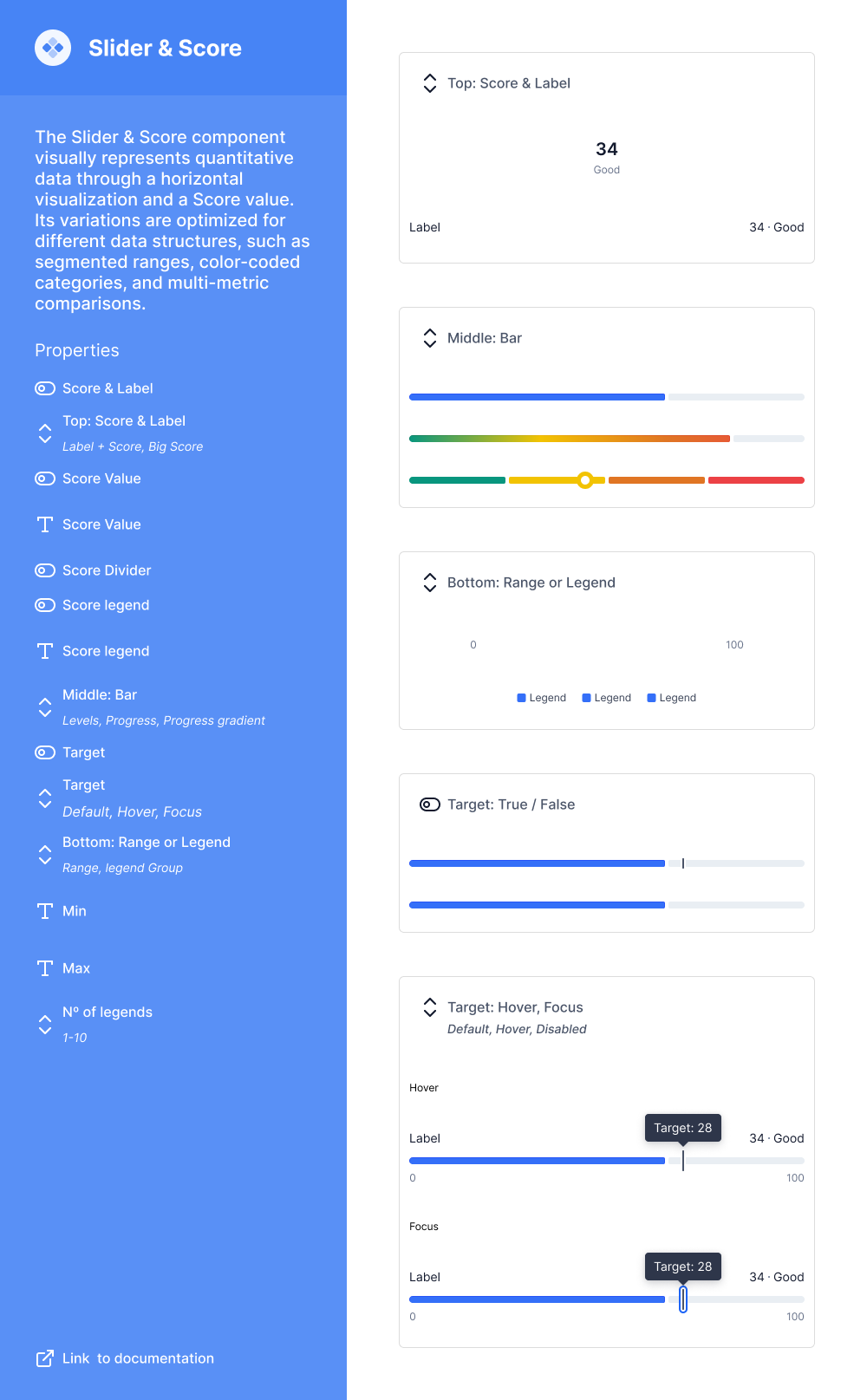
Data Viz slider + risk score component used in Dashboards
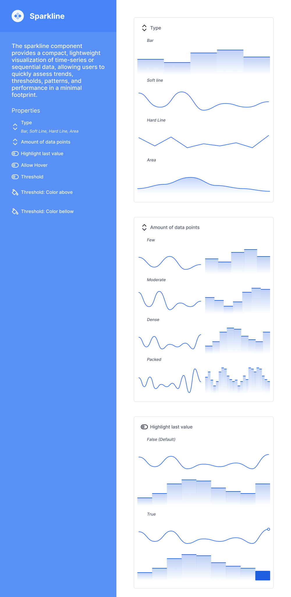
Data Viz Component for a Sparkline
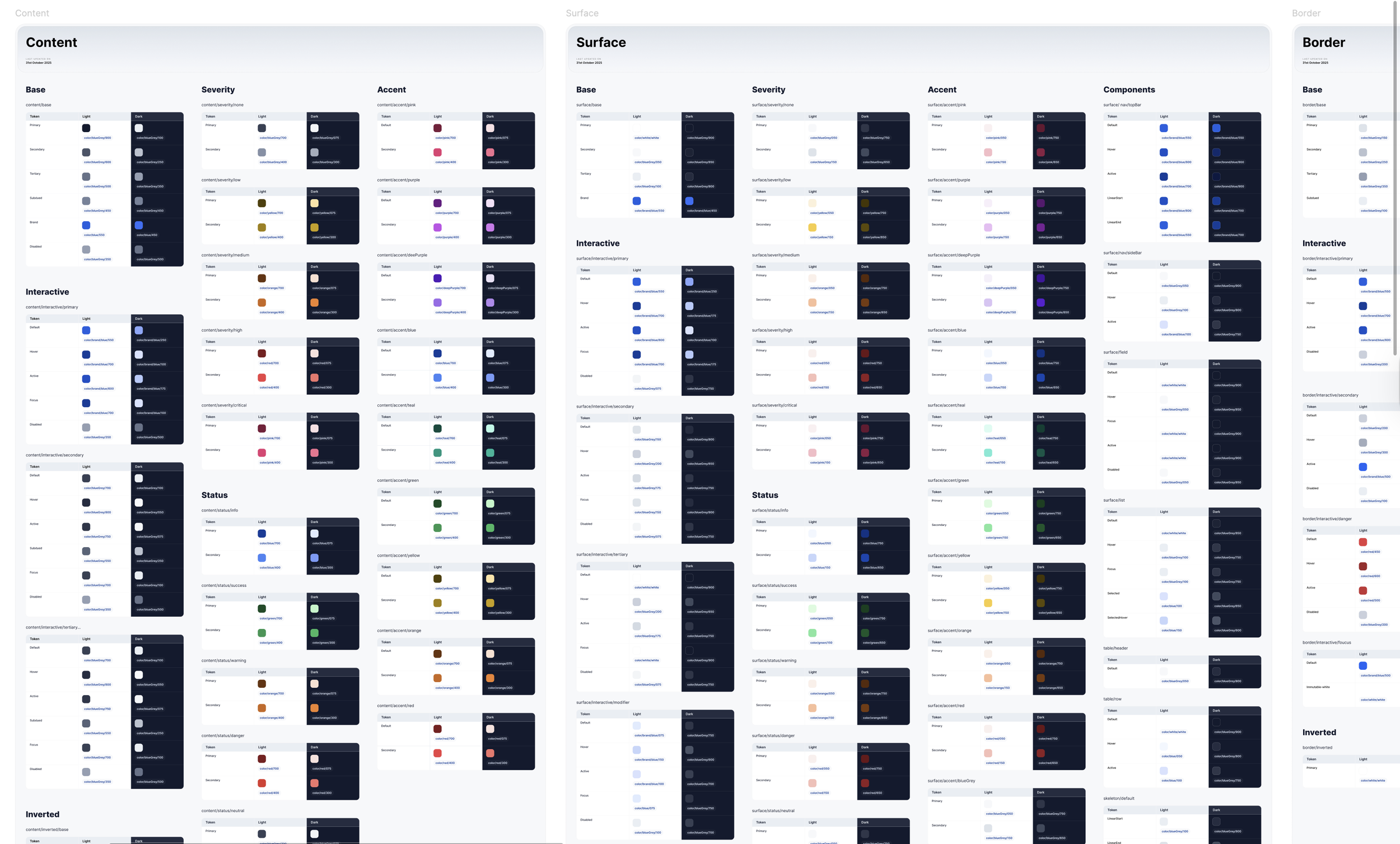
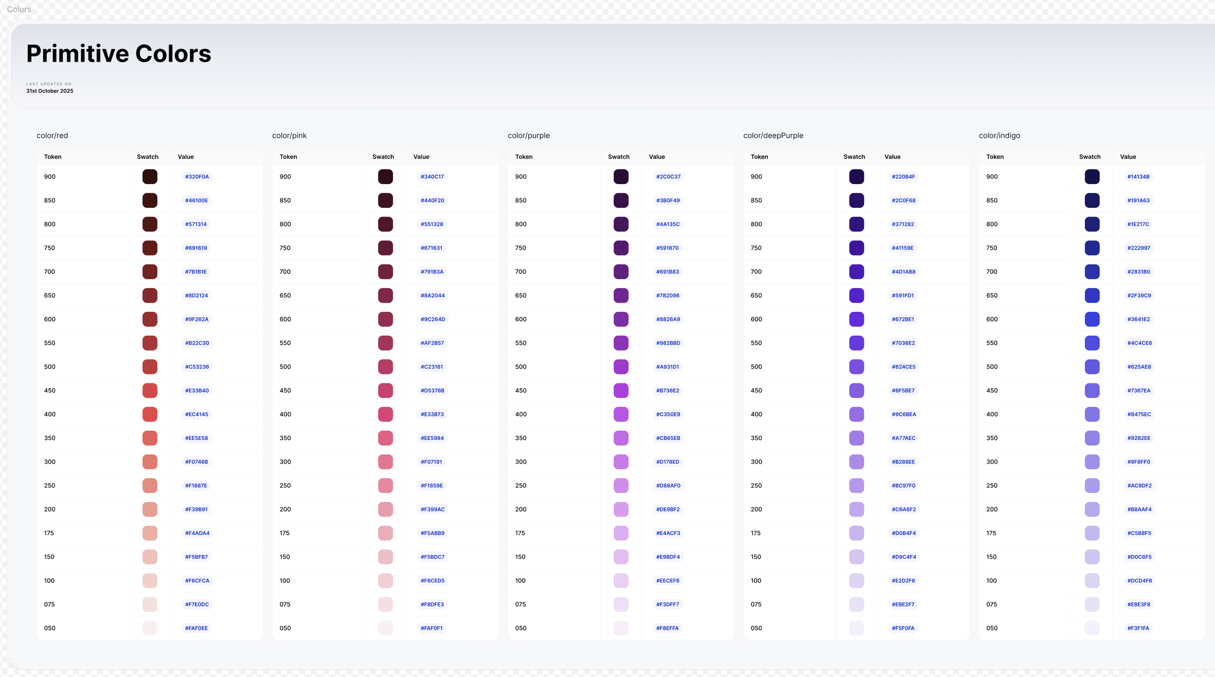
Color swatches from Web Variables, semantic tokens
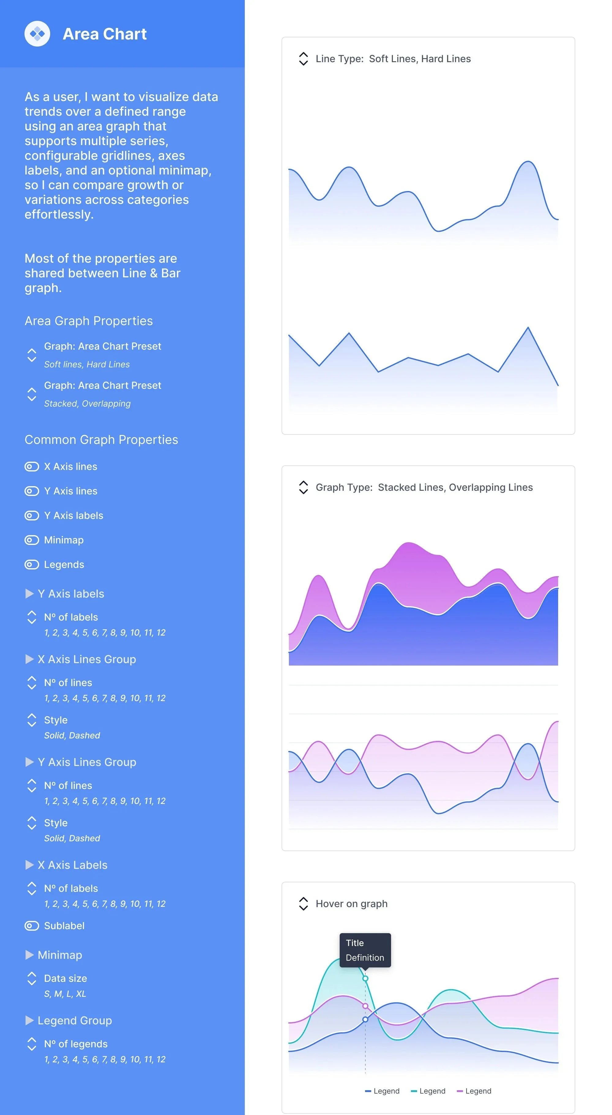
Data Viz Component for an Area Chart
Primitives, base for semantic tokens
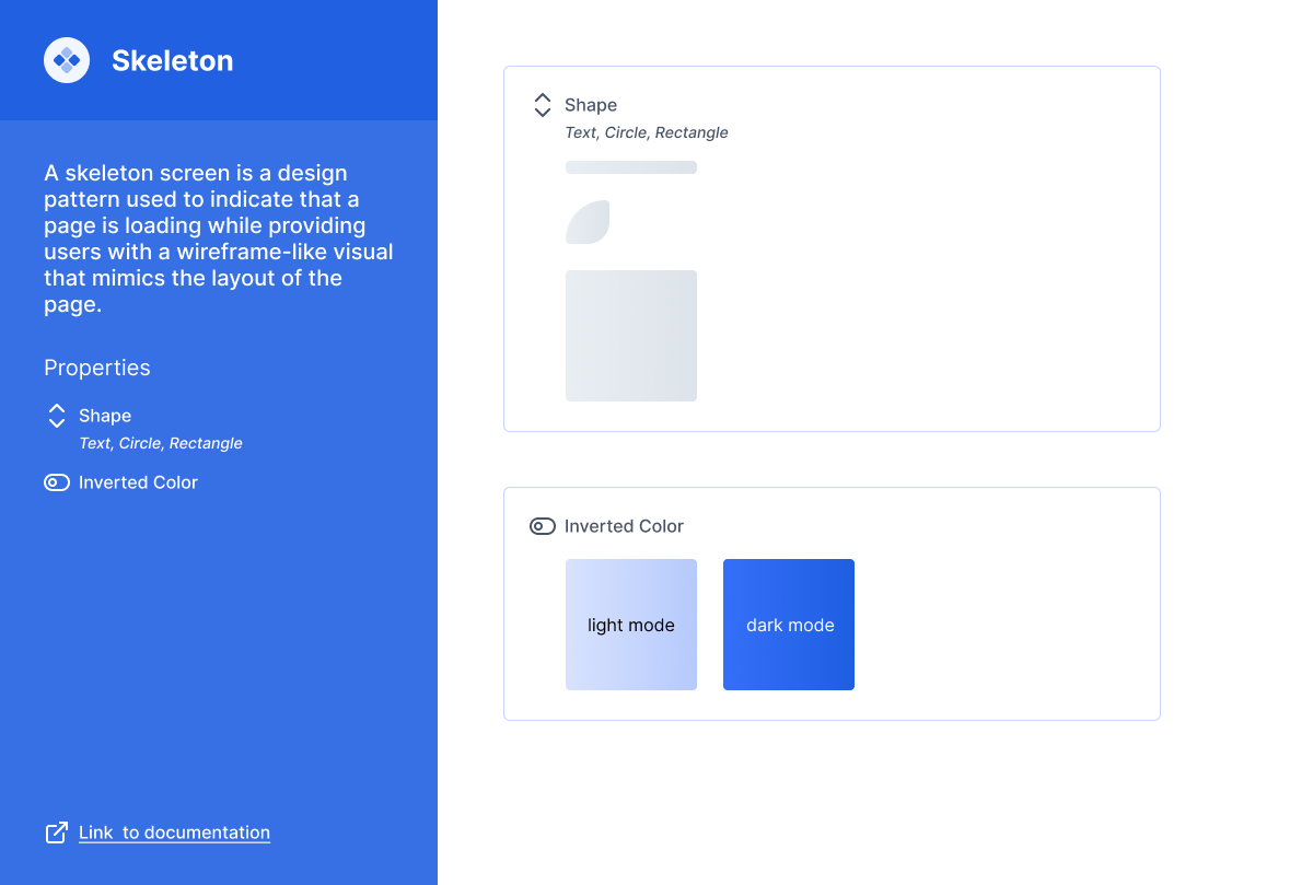
Skeleton loader
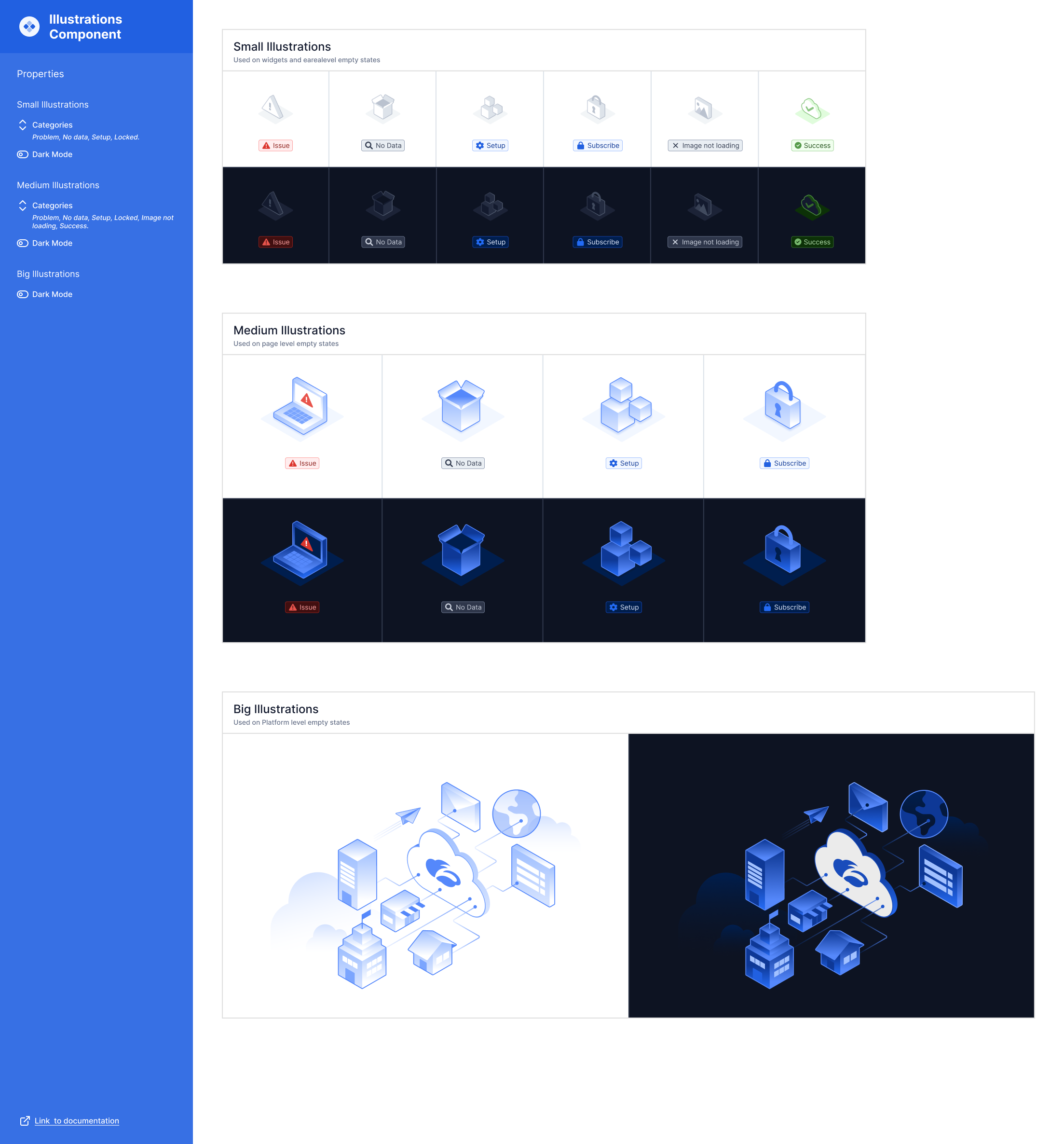
Illustrations for Empty States, Errors, etc
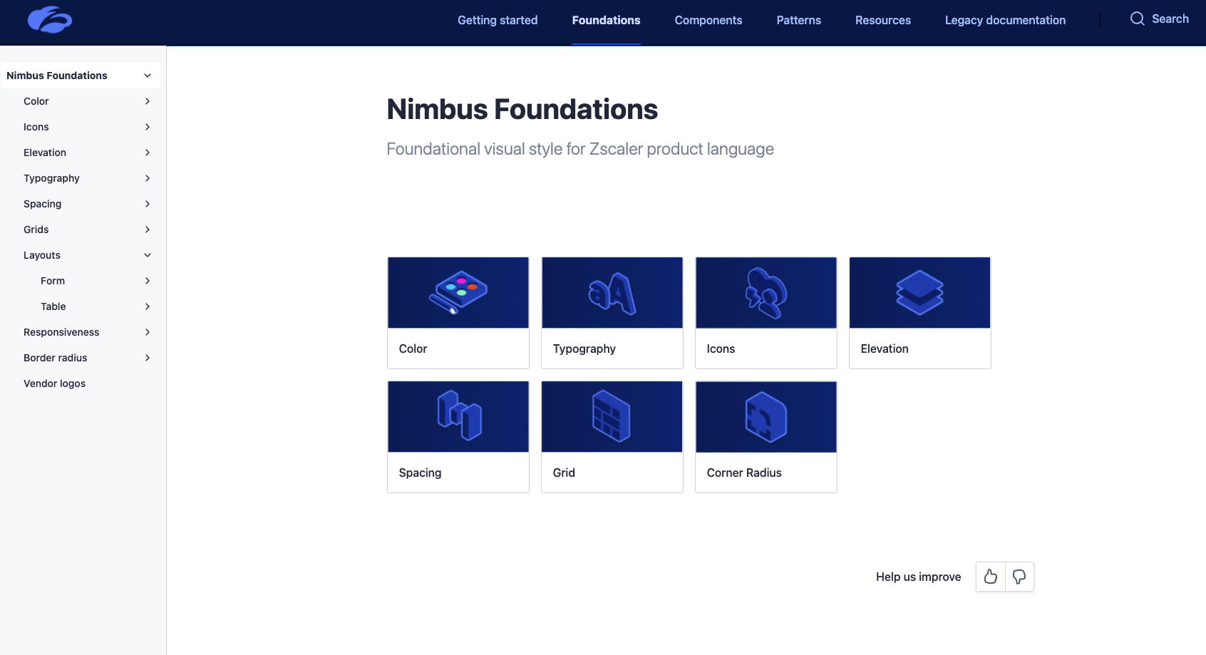
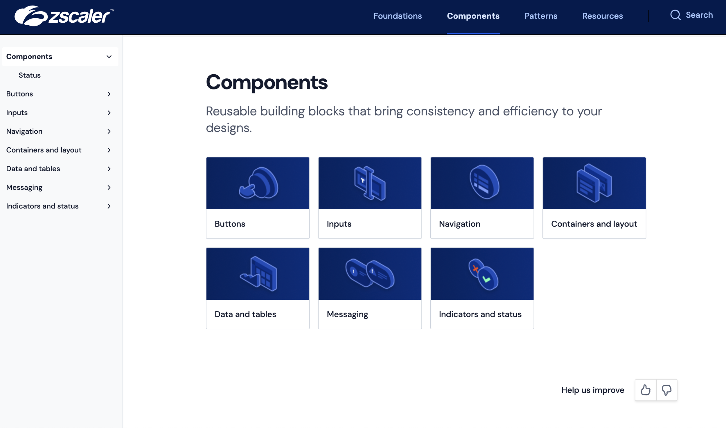
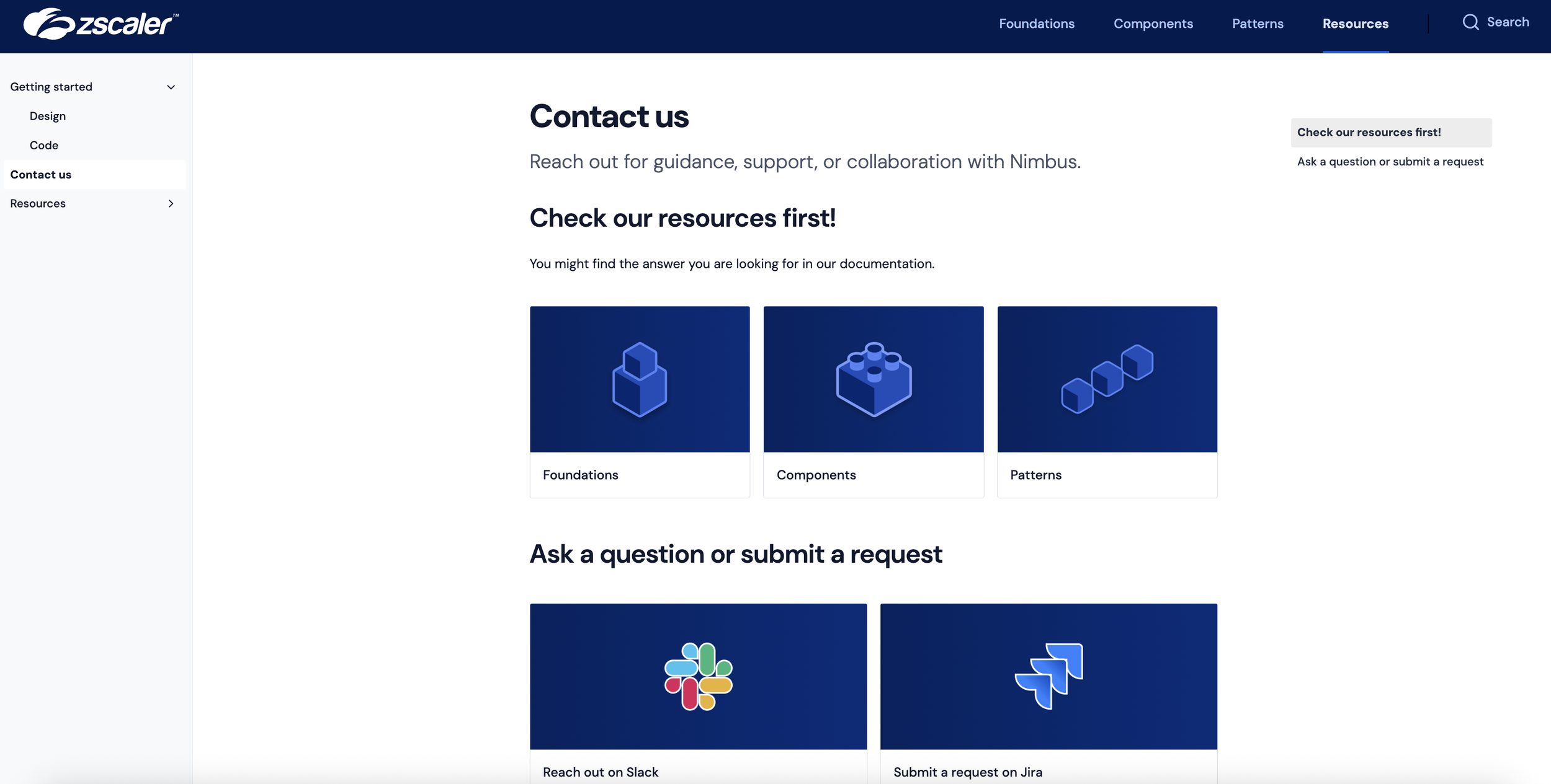
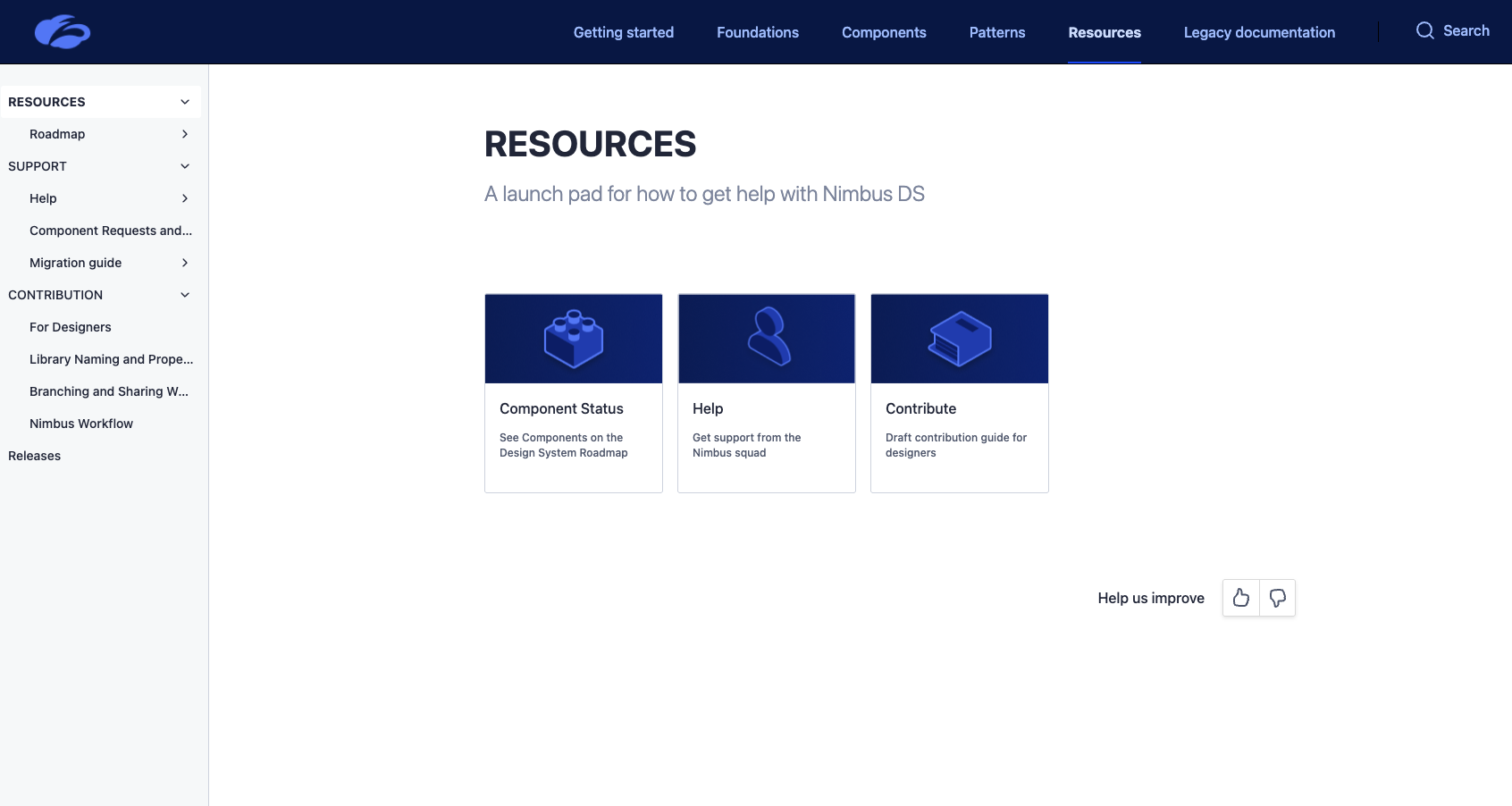
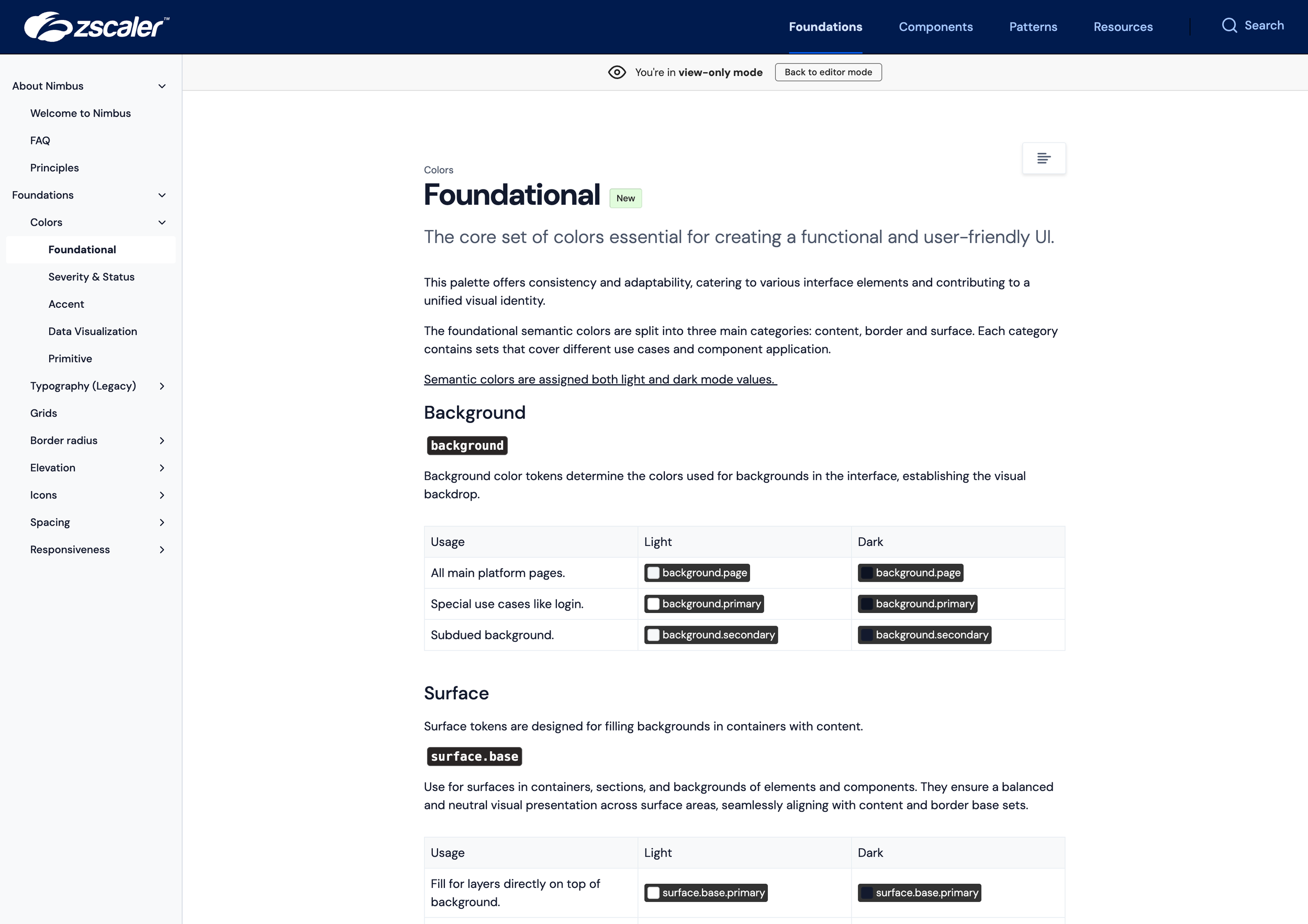
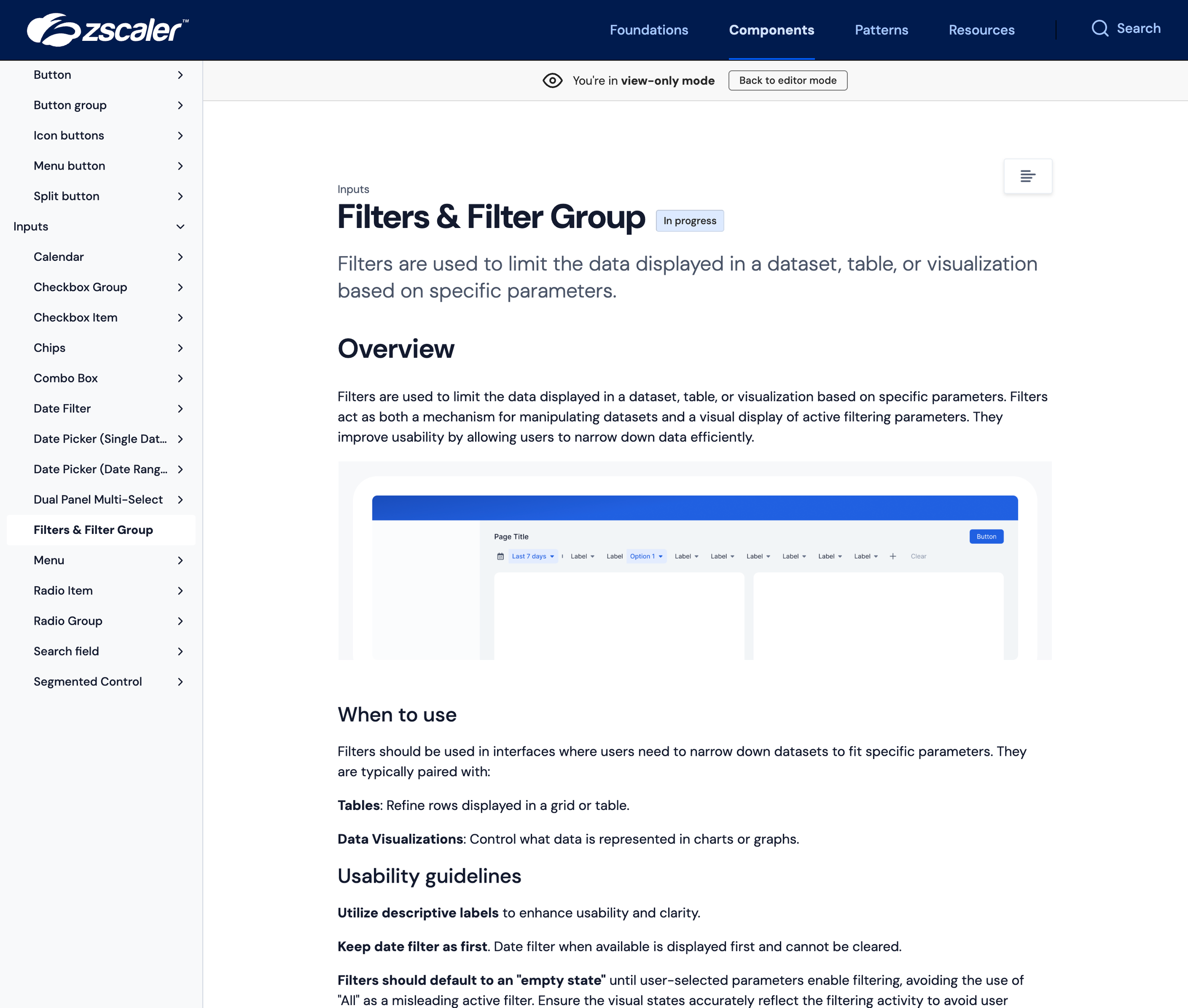
Design System Documentation
Under my ownership, I built out the company-wide documentation hub to connect Figma, Storybook, and engineering guidance into a single, accessible source. It includes best practices, do’s and don’ts, implementation details, roadmap visibility, and a help portal, giving every designer and developer a clear path to using and shipping components the right way. See some snaps of our docs site below. Click on an image to enlarge.
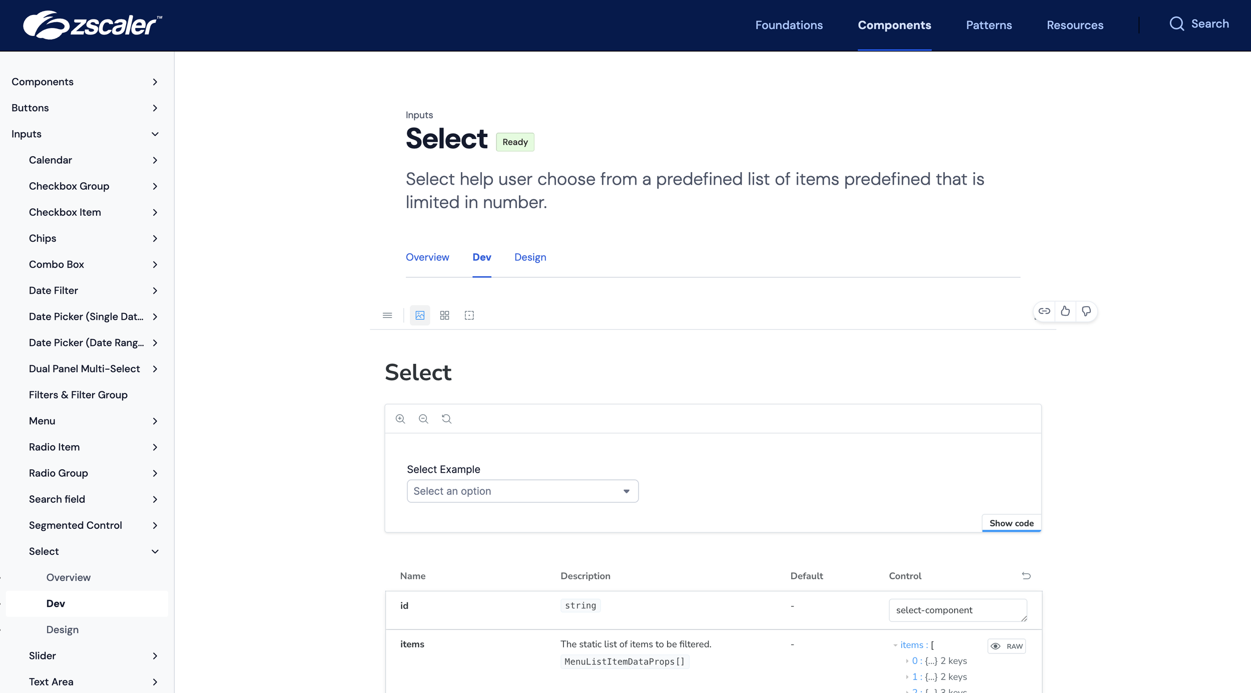
Side by side Design & Dev
Check out a video walkthrough of how our documentation brings design and engineering together. The “Design” and “Dev” tabs live side-by-side, giving teams one place to explore component behavior, specs, and code so everyone works from the same source of truth.
Library Ecosystem
The Nimbus library ecosystem establishes a shared mental model for how the design system is structured and scaled. Foundations, components, patterns, and product-specific work each have a clear home, ownership model, and lifecycle. This clarity reduces duplication, removes ambiguity for designers and engineers, and creates a durable foundation for system growth across teams and products.
UI Kit & Documentation Template System
I introduced a standardized Figma template, which is part of our onboarding infrastructure for designers entering the system. The visual on the right explains how libraries and files are organized, where different types of assets live, and how work flows through the ecosystem.
Components are intentionally split into:
Stable masters (production-aligned and locked)
Flexible supporting assets (demos, prototypes, annotations that evolve quickly)
This separation allows documentation and exploration to move quickly without destabilizing core components, which helps make the system easier to learn, safer to extend, and more reliable.
Integrating AI & Nimbus Design System
I led the initiative to align AI tooling with the Nimbus Design System by evaluating vendors, piloting emerging tools, and driving the adoption of integrations, such as Figma Make. My focus was on ensuring AI-powered workflows generate prototypes and code using real Nimbus components, enabling faster iteration and production-aligned output across design, product, and engineering teams.
-
Our teams are exploring AI tools at different speeds and in different ways. Aligning these efforts around Nimbus gives us a shared foundation for experimentation so that early learnings aren’t siloed, and future tools can plug into a consistent design system instead of creating more fragmentation.
-
AI-generated UI is only valuable if it reflects the real product. By integrating Nimbus components into our AI workflows, we’re making sure that prototypes, concepts, and early code stay aligned with our actual design and engineering standards, even as we continue testing vendors and capabilities.
-
As we evaluate tools like Figma Make and external prototyping platforms, we’re focused on enabling PMs, designers, and engineers to explore ideas more quickly with prototypes grounded in Nimbus. The goal isn’t just speed, but speed with accuracy as we refine the right tooling stack.
Impact
Reduced design and front-end duplication by over 60% across product teams.
Enabled engineers to implement consistent UI faster, cutting average handoff time by 40%.
Established Nimbus as the single source of truth for design and development alignment.
Grew a design system team from 2 Staff IC’s to 7 Senior designers over 1.5 years, boosting output quarter over quarter while balancing quality with increased speed of delivery.
Built a culture of collaboration by building out regular practice for in-person workshops with vendors like Figma + AI design tools like Builder.io + Loveable, cross-organizational reviews, sprint demos + retros, and more.
Led platform unification with leadership through design system adoption to unify 10+ disparate applications into a single unified experience center (see press release).
Highlights
Leadership + Management: built a team of 7 amazing design system designers to ship more faster and sustain quality system assets.
Component coverage: 50+ reusable components and composite patterns.
Documentation: Comprehensive guidance for design, usage, and accessibility.
Scalability: Built to support multiple product verticals, platformization initiatives, and evolving brand needs.
Governance: Clear contribution model and review checkpoints for ongoing evolution.
Reflection
Nimbus represents not just a library, but a foundation for design and engineering collaboration. My goal was to empower my team and consuming teams to build with confidence, focus on solving real user problems, and ensure Zscaler’s visual and interaction language can scale with the company’s growth as it merges over 10 legacy applications into a single modern platform.